
Theming and colors
Blender's Dark and Light themes in BUI, how to switch between them from every language, where the colors come from, and what else you can change.
BUI looks like Blender because it uses Blender’s themes: the same grays, the same blue for selection, the same rounded corners and the same icons. That’s what makes a BUI tool feel instantly familiar to the millions of people who use Blender.
This page shows how to switch between Blender’s Dark and Light themes, where the colors come from, how widgets use them, and what else you can change.
Dark or light
BUI has both of Blender’s built-in themes: Blender Dark (the default) and Blender Light. Switch with one call and every open window redraws: widgets, panels, menus, the file browser, the node editor, and the styled parts of Rust and JavaScript pages.
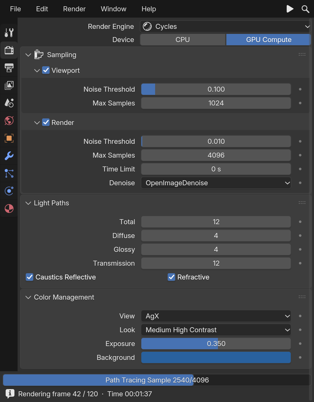
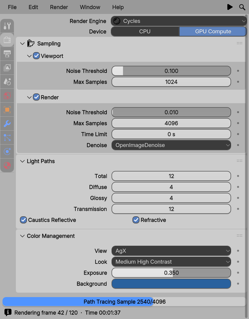
import blenderui as bui
bui.set_theme("light")          # or "dark"bui.theme_name()                # "light"bui.theme_color("region_bg")    # (r, g, b, a), each 0..1
An unknown name raises ValueError. In a blenderui.imgui program, set_theme restyles ImGui as well.
use blenderui::prelude::*;
fn main() {    blenderui::set_theme("light"); // false for an unknown name    // or, when you build the app:    Application::new().theme("light").run(|cx| { /* open windows */ });}
blenderui::theme_name() and blenderui::theme_color("region_bg") read the active theme.
const { App } = require('@blender-ui/native')
const app = new App({ theme: 'light' })app.setTheme('dark') // open windows redraw
With React, pass it to render: render(<App />, { theme: 'light' }).
BK_set_theme("light"); /* returns 0 for an unknown name */const char *name = BK_theme_name(); /* "dark" or "light" */float rgba[4];BK_theme_color("regular.inner", rgba);BK_set_theme("light");ImGui_ImplBUI_StyleBlender(); // re-read the theme's colors into ImGui's styleImGui_ImplBUI_StyleBlender() copies the active theme’s colors when you call it, so call it again after switching.
Without a call, the BUI_THEME environment variable picks the theme: BUI_THEME=light. Names are case-insensitive, and Blender’s preset names work too ("Blender Light"). An explicit call wins over the variable.
Where the colors come from
Blender ships its default theme in release/datafiles/userdef/userdef_default_theme.c, plus two interface presets, Blender_Dark.xml and Blender_Light.xml. BUI compiles both Blender 5.x presets into the kit (kit/intern/kit_theme_presets.c, generated by tools/gen_theme.py), so every widget, in every language, reads the same values.
A theme is a set of widget color sets, one per kind of widget. Blender calls each one a wcol (for “widget colors”). BUI has twenty:
regular, tool, toggle, radio, option, textfield, num, numslider, menu, pulldown, menu_back, menu_item, list_item, box, scroll, progress, tooltip, tab, pie_menu and curve.
Each color set has the same fields:
| Field | What it colors |
|---|---|
outline, outline_sel |
The widget’s border, normal and selected |
inner, inner_sel |
The fill, normal and selected (or pressed) |
item |
The part inside: a slider’s bar, a checkmark, a menu arrow |
text, text_sel |
The label, normal and selected |
roundness |
Corner radius, as a fraction of the widget unit |
shaded, shadetop, shadedown |
An optional top-to-bottom gradient on the fill |
Besides the color sets, the theme has region and panel colors, text colors, the text cursor and selection, the menu shadow, and the file browser’s and node editor’s colors.
The colors you’ll see most
| Where | Dark | Light |
|---|---|---|
Window background (region_bg) |
#303030 |
#b3b3b3 |
| Panel header and body | #3d3d3d |
#cccccc |
Button fill (regular.inner) |
#545454 |
#dbdbdb |
Text-field fill (textfield.inner) |
#1d1d1d |
#282828 |
Selected or pressed (regular.inner_sel) |
#4772b3 |
#668ccc |
Button text (regular.text) |
#e6e6e6 |
#1a1a1a |
Text cursor (cursor) |
#71a8ff |
#3399e6 |
In the dark theme, widget corners are 0.2 widget units round (panels 0.4, scrollbars 0.5); the light preset rounds widgets more (0.4). theme_color(key) returns any of these from code: a plain key such as "region_bg", or "<set>.<field>" such as "regular.inner".
How widgets use them
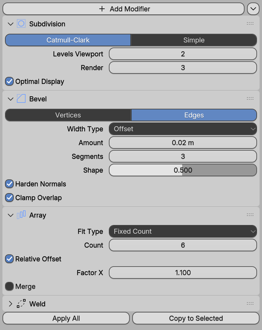
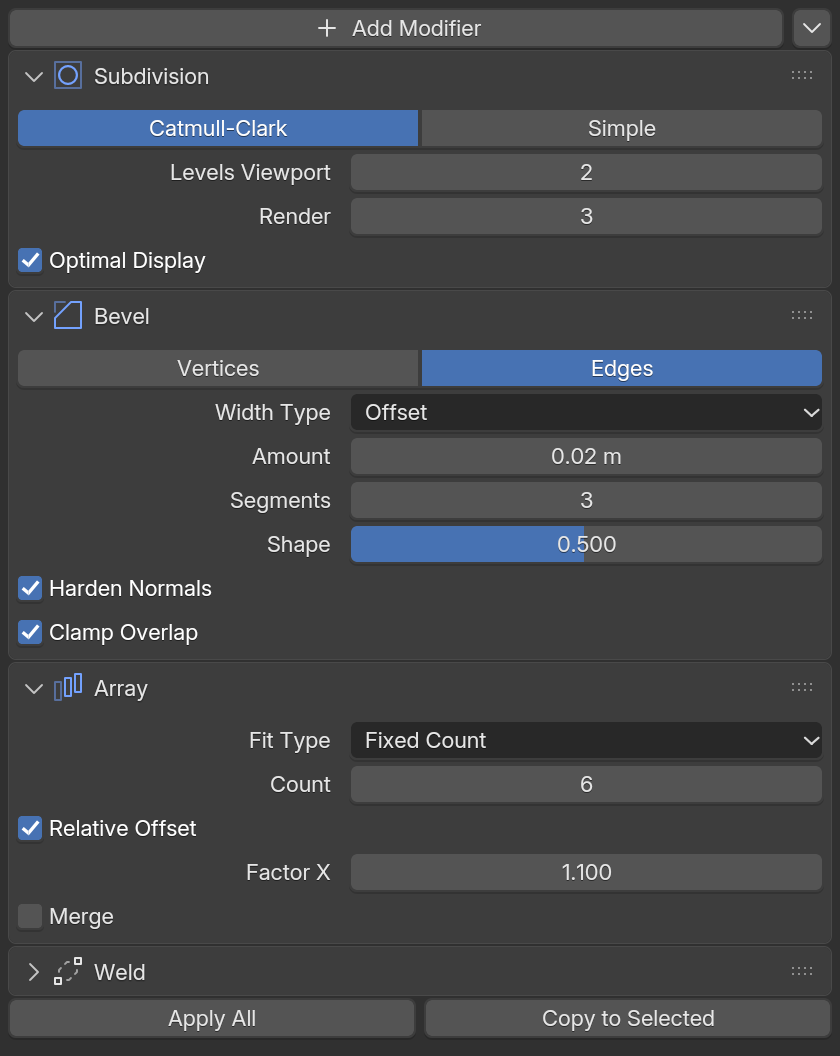
examples/site/kit_modifiers.c). Switch this site's theme to see the light preset.A widget picks its color set by kind, then adjusts it for its state, exactly as interface_widgets.cc does:
- Selected or pressed: the
_selcolors replace the normal ones, and the gradient flips. - Hovered: the fill and text lighten a little (Blender’s
widget_active_color). - Disabled: the widget is drawn faded, at half strength.
Icons
BUI includes all 781 of Blender’s SVG icons (from release/datafiles/icons_svg). They’re rasterized with Blender’s own nanosvg code, the way Blender does it, so they’re sharp at any UI scale.
- Mono icons take the text color, or their theme color where Blender gives them one: object orange, modifier blue and so on.
- Color icons keep their own colors.
Use them by Blender’s name: Button("Add", icon="ADD"). From Python, buipy.kit_icon_names() lists every name, and from C, BK_icon_list_count() and BK_icon_list_name().
Sizes and the UI scale
Blender sizes everything from one number, the widget unit: 20 pixels at scale 1. Button heights, paddings, indents and roundness are all fractions or multiples of it. UI text is 11 pt at scale 1.
Change the scale, and the whole UI grows or shrinks together, like Blender’s Resolution Scale preference:
| Where | How |
|---|---|
| Any app | BUI_UI_SCALE=1.5 |
| Python | buipy.kit_set_scale(1.5) |
| C | BK_set_scale(1.5f) |
The scale is clamped to 0.5–4. By default it follows the display’s DPI (see Window hosts).
What else you can change
Beyond picking Dark or Light, you can color individual things, and how much depends on the API:
| API | What you can change |
|---|---|
| tkinter syntax | bg on frames, canvases and windows; fg on text; font (size and bold). Look-only Tk options (relief, activebackground, ttk.Style …) are accepted but don’t change what’s drawn. |
| Qt syntax | setStyleSheet with color, background on containers and font-weight: bold; anything you paint yourself with QPainter |
| Blender components | Label(..., color=...), a node’s header color with Node(..., kind=...) or color=, anything drawn on a Canvas |
| Rust and JavaScript | Everything, with CSS and Tailwind, on plain HTML elements. Inside styled, and on Blender components, the Blender theme applies. |
| Dear ImGui | Dear ImGui’s own style (ImGui::GetStyle().Colors, imgui.get_style().colors …) for ImGui’s widgets. BUI starts it from the active Blender theme. |
| C | Per-node colors through BK_set_color where a node has a color property; anything on a canvas |
The two presets are the whole theme system: BUI doesn’t load Blender theme files (.xml), and there’s no call to change a single theme color. theme_color reads colors; nothing writes them.
Next steps
Last updated