
Components reference
Every class and helper exported by blenderui.components, with its signature, its useful members and a small example, grouped the way you'll look for them.
- Python
This page lists everything blenderui.components exports, with the exact signatures from the source. When you know what you want and need the argument names, you’re in the right place. For how the pieces fit together, start with the components guide.
Reading the signatures: arguments after * are keyword-only. Every component also accepts the common keywords below, and every value component the value keywords.
Common keywords
Every component takes these, and has them as properties:
| Keyword | Default | Meaning |
|---|---|---|
description |
"" |
Tooltip text, shown after hovering |
enabled |
True |
False greys it out and ignores input |
visible |
True |
False hides it |
weight |
1.0 |
Share of the width in a Row; 0 keeps the natural width |
fill |
False |
In a column, grow into the spare height (an editor filling its area) |
Properties after layout: x, y, w, h and rect ((x, y, w, h)). Containers have add(*children), remove(child) and children.
Value components
Components that hold a value take label and value as their first two arguments (except where noted), plus:
| Keyword or member | Meaning |
|---|---|
on_change=fn |
Called as fn(value) when the user or your code changes the value |
default= |
The value reset() returns to; defaults to the starting value. (Dropdown, EnumRow and ColorSwatch always use their starting value.) |
.value |
Read or set the value; setting notifies on_change |
.set_value(v, notify=True) |
Set, optionally without the callback |
.reset() |
Back to the default; users press Backspace over the widget |
.label |
The label text |
App and helpers
| Name | Signature | Notes |
|---|---|---|
App |
App(title="BUI", size=(420, 640), *children, padding=None, spacing=None, header=None) |
The window. children go into app.root, a Column. header takes a MenuBar. |
Component |
Component(*, description="", enabled=True, visible=True, weight=1.0, fill=False) |
The base class of every component. |
ValueComponent |
ValueComponent(label="", value=None, *, default=None, on_change=None, **kw) |
The base class of value components. |
unit() |
unit() -> int |
Blender’s widget unit in pixels: 20 at scale 1. Use it to size things like Blender does. |
eval_number() |
eval_number(text) -> float |
Blender-style number input: eval_number("2*pi"), "1/3 + 2^2", "sqrt(2)". |
App members: run(native=None), open(native=None), add(*components), bind(combo, fn), ctx, root, render_raster(w=None, h=None, full=False), and the input methods press, release, motion, key, wheel and context_menu (headless testing).
Layout
| Component | Signature | Notes |
|---|---|---|
Column |
Column(*children, align=False, spacing=None, padding=0) |
Vertical stack. align=True joins widgets into one block. |
Row |
Row(*children, align=False, spacing=None, padding=0) |
Horizontal; children share the width by weight. |
Split |
Split(left, right, factor=0.4) |
left gets factor of the width. Blender’s property rows. |
Grid |
Grid(*children, columns=2) |
Equal-width columns, filled row by row. |
Box |
Box(*children, align=False, spacing=None, padding=0) |
A padded column on Blender’s box background. |
Panel |
Panel(title, *children, collapsed=False, icon=None, header=(), on_toggle=None, category=None) |
Collapsible; a panel inside a panel is a sub-panel. header=[Checkbox("", True)] puts components in the header. category picks its tab inside a Sidebar. Members: collapsed, toggle(), title, body. |
Tabs |
Tabs([("Title", component), ...], current=0, on_change=None) |
Pages with tabs. on_change(index). Members: current, select(i), titles. |
SideTabs |
SideTabs([("ICON", "Title", component), ...], current=0, on_change=None) |
The properties editor’s icon tabs on the left; hover shows the name. None between pages starts a new group. Member: page. |
Sidebar |
Sidebar(*panels, current=0, on_change=None) |
An editor’s N-panel: panels with a category show under one tab per category, along the right edge. Ctrl+Wheel cycles tabs. |
ScrollView |
ScrollView(child, height=None, rows=8) |
A fixed-height viewport over a taller child, with the wheel and a draggable bar. Height is height pixels, or rows widget rows. |
VectorField |
VectorField(label="", value=(0.0, 0.0, 0.0), *, axes="XYZW", on_change=None, **number_kw) |
Aligned number fields, one per component. Extra keywords (suffix, step, min …) go to each field. Alt+drag edits all of them; Ctrl+Alt+C / Ctrl+Alt+V copy and paste the vector. |
from blenderui.components import App, Panel, SideTabs, Tabs, ScrollView, Column, Label
pages = SideTabs([("OBJECT_DATA", "Object", Panel("Transform", Label("…"))),                  ("MATERIAL", "Material", Panel("Surface", Label("…")))])long_list = ScrollView(Column(*[Label("Row %d" % i) for i in range(50)]), rows=6)App("Layout", (420, 400), pages, Tabs([("List", long_list), ("Empty", Label(""))])).run()
Values
| Component | Signature | Notes |
|---|---|---|
NumberField |
NumberField(label="", value=0.0, *, min=None, max=None, step=None, precision=None, integer=None, suffix="") |
Drag to scrub, arrows to step, click to type math. suffix is shown after the number (" m", "°"). Member: editing. |
NumberSlider |
NumberSlider(label="", value=0.0, *, min=0.0, max=1.0, **kw) |
A number field that fills with the value. Takes NumberField’s other keywords. |
TextField |
TextField(label="", value="", *, placeholder="", icon=None, live=False) |
Single-line text with Blender’s editing. live=True reports every keystroke; otherwise on_change runs when you confirm. Member: editing. |
SearchField |
SearchField(value="", *, placeholder="Search") |
A search box with a magnifier icon. Note: no label argument. |
HotkeyField |
HotkeyField(label="", value="") |
Click, then press a key combination; Esc cancels. Member: capturing. |
Checkbox |
Checkbox(label="", value=False) |
Drag across several to set them all. Member: toggle(). |
Toggle |
Toggle(label="", value=False, *, icon=None, icon_on=None, emboss=True) |
A button that stays pressed. icon_on is shown while on; emboss=False draws Blender’s flat header toggle. |
Decorator |
Decorator(label="", value=False) |
The keyframe dot next to a property; it turns into a diamond. |
Dropdown |
Dropdown(label="", items=(), value=None, *, icon_only=False, icons=None) |
A menu of items (strings); type to search. The value is the chosen string. icons is a list of icon names, one per item. Members: items, index. |
EnumRow |
EnumRow(label="", items=(), value=None, *, vertical=False, icon_only=False, icons=None) |
The same choice as joined buttons. vertical=True stacks them. |
ColorSwatch |
ColorSwatch(label="", value=(1.0, 1.0, 1.0, 1.0), *, picker="circle", alpha=True) |
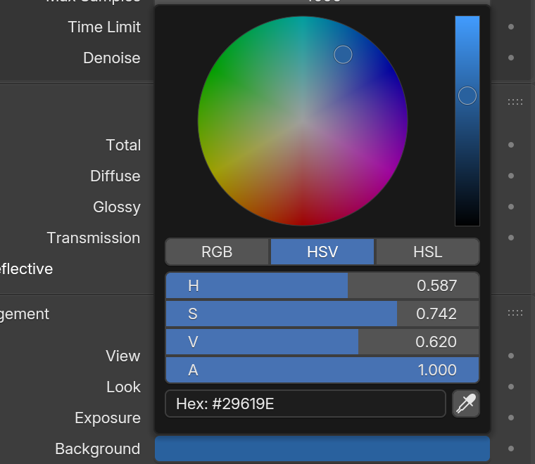
RGBA, each 0 to 1. Click for Blender’s color picker: picker="circle" (HSV wheel) or "square", RGB / HSV / HSL sliders, hex and an eyedropper. Ctrl+C copies the hex. |
from blenderui.components import (App, Panel, NumberField, NumberSlider, VectorField,                                  TextField, SearchField, Row, Checkbox, Toggle,                                  Dropdown, EnumRow, ColorSwatch, HotkeyField,                                  Split, Label, ProgressBar)
App("Gallery", (360, 380), Panel("Values",    NumberField("Count", 3, min=0, max=10, integer=True),    NumberField("Angle", 45.0, suffix="°", precision=1),    NumberSlider("Opacity", 0.8),    VectorField("Location", (0.0, 1.25, 0.0)),    TextField("Name", "Cube", placeholder="Name"),    SearchField(),    Row(Checkbox("Shadows", True), Toggle("Lock", icon="UNLOCKED", icon_on="LOCKED")),    Dropdown("Mode", ["Object Mode", "Edit Mode", "Sculpt Mode"]),    EnumRow("Pivot", ["Bounds", "Cursor", "Median"], "Median"),    ColorSwatch("Color", (0.8, 0.3, 0.1, 1.0)),    HotkeyField("Shortcut", "ctrl+s"),    Split(Label("Label"), ProgressBar(0.6, "Baking 60%")))).run()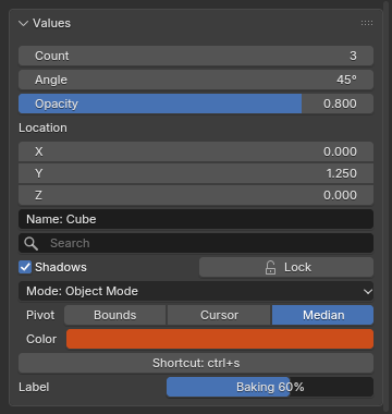
Buttons, labels and feedback
| Component | Signature | Notes |
|---|---|---|
Button |
Button(text="", on_click=None, *, icon=None, emboss=True) |
on_click() runs on release over the button. emboss=False draws it flat. Members: text, click(). |
IconButton |
IconButton(icon, on_click=None, *, emboss=False) |
Icon only; flat unless emboss=True. |
Popover |
Popover(text, *children, icon=None) |
A button that opens a panel of components. Member: body. |
Label |
Label(text="", *, icon=None, align="left", color=None, bold=False) |
align is "left", "center" or "right"; color is RGBA. Member: text. |
ProgressBar |
ProgressBar(value=0.0, text=None) |
value from 0 to 1; text replaces the percentage. Members: value, set_value(v), text. |
Separator |
Separator(factor=0.5, line=False) |
Vertical space of factor widget units, optionally with a line. |
Spacer |
Spacer() |
Empty space that takes its weight share of a Row; pushes what follows to the right. |
MenuButton is under Menus.
Views
| Component | Signature | Notes |
|---|---|---|
ListView |
ListView(items=(), value=0, *, rows=5, on_rename=None, icons=None) |
Blender’s UI list. The value is the selected index. Double-click or F2 renames: on_rename(index, name). Members: items, scroll, editing. |
TreeView |
TreeView(roots=(), *, rows=8, columns=(), on_toggle=None, on_rename=None) |
The outliner. The value is the selected TreeItem. columns=("hide", "render") adds toggle columns; on_toggle(item, column, on). on_rename(item, name). Members: roots, row_count, rows_info. |
TreeItem |
TreeItem(label, *children, icon=None, expanded=True, data=None, toggles=None) |
One row of a TreeView. toggles={"hide": False} sets its columns; data is yours. Members: add(*items), expanded. |
GridView |
GridView(items=(), value=0, *, tile=4.0, rows=2.0, on_activate=None) |
Preview tiles. Items are (label, preview), where preview is an icon name or an RGBA color. Double-click or Enter: on_activate(index). Members: items, tile_rect(i). |
In lists and trees, arrow keys navigate, Left and Right collapse and expand (Shift+click an arrow for all children), and you can drag down a toggle column to set it on several rows.
Menus
| Name | Signature | Notes |
|---|---|---|
MenuItem |
MenuItem(text, on_click=None, *, icon=None, shortcut=None, checked=None, submenu=None, enabled=True, description="") |
One entry. checked=True / False shows a checkbox; submenu=[...] opens another menu; shortcut is the text shown on the right. |
MenuButton |
MenuButton(text, items, *, icon=None) |
A pulldown button (File, Edit …). |
MenuBar |
MenuBar(("File", items), ("Edit", items), ..., right=()) |
Blender’s top bar, for App(header=...). right holds components at the right end. |
Menu |
Menu.show(ctx, owner, items, title=None, at=None, on_pick=None) |
Opens a popup menu from code, by owner or at at=(x, y). Plain-string items call on_pick(text). |
PieMenu |
PieMenu.show(ctx, items, title="") |
A pie around the pointer: up to 8 items, placed W, E, S, N, NW, NE, SW, SE. Flick toward one and click, or press 1–8. |
Items in any menu are MenuItems, plain strings, or "-" for a separator.
from blenderui.components import App, Button, Menu
add = Button("Add", icon="ADD")app = App("Menus", (300, 200), add)add.on_click = lambda: Menu.show(app.ctx, add, ["Cube", "Sphere", "-", "Monkey"],                                 "Add", on_pick=print)app.run()
Color and editors
| Component | Signature | Notes |
|---|---|---|
ColorRamp |
ColorRamp(stops=((0.0, (0, 0, 0, 1)), (1.0, (1, 1, 1, 1))), *, interpolation="Linear", on_change=None) |
Blender’s color ramp. Click a stop to select it, drag to move, Ctrl+click to add, X or Delete to remove. interpolation is "Linear", "Ease", "B-Spline" or "Constant". on_change(stops). Members: stops, sorted_stops(), active, interpolation, evaluate(t), add_stop(pos=None), remove_stop(). |
ColorStop |
ColorStop(pos, color) |
One stop of a ramp, with pos and color. |
CurveMapping |
CurveMapping(points=((0.0, 0.0), (1.0, 1.0)), *, channels=(), height=8.0, on_change=None) |
Blender’s curve widget. Click the curve to add a point, drag points (Ctrl snaps), X removes. channels=("C", "R", "G", "B") adds channel tabs. on_change(channel, points). Members: channel, points, evaluate(x, channel=None), reset(), remove_selected(). |
NormalBall |
NormalBall(label="", value=(0.0, 0.0, 1.0), *, size=4.0) |
A direction picker drawn as a lit sphere; drag to aim. |
Histogram |
Histogram(bins=(), *, height=5.0) |
Display only. bins are values or (r, g, b) triples, each 0 to 1. Member: set_bins(bins). |
IDSelector |
IDSelector(items=(), value=None, *, icon="MESH_DATA", fake_user=False, on_change=None, on_new=None, on_unlink=None) |
Blender’s data-block selector (template_ID). Members: items, value, set_value(name, notify=True). |
PathField |
PathField(label="", value="", *, directory=False, on_browse=None, on_change=None) |
A path with a folder button. on_browse() may return a path; without it a dialog opens. Members: value, set_value(path, notify=True), browse(). |
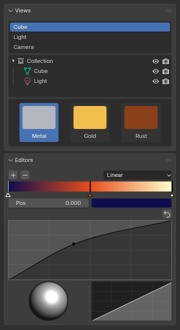
ListView, TreeView, GridView, ColorRamp, CurveMapping, NormalBall and Histogram.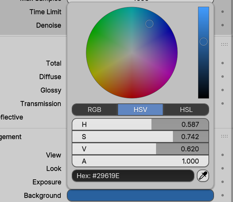
ColorSwatch and Blender's color picker opens.Node editor and areas
| Component | Signature | Notes |
|---|---|---|
Node |
Node(title="Node", *, inputs=(), outputs=(), location=(0.0, 0.0), width=140.0, kind="converter", color=None, collapsed=False, on_change=None) |
Inputs are (name, type) or (name, type, value); a value draws a field while the input is unlinked. Outputs are (name, type). on_change(node, what, value). Members: location, selected, collapsed, input_value(i). |
NodeEditor |
NodeEditor(nodes=(), *, links=(), on_links=None, on_delete=None) |
The node canvas. Links are (from_node, output, to_node, input). on_links(links) runs after the user links, relinks or cuts; on_delete(nodes) on X / Delete (without it, the editor removes the selection itself). Members: nodes, add_node(), remove_node(), links, selected, zoom, view_all(). |
Area |
Area(editor, body, *, header=(), on_editor=None) |
A Blender area: a header with the editor-type menu (editor is its name), then body filling the rest. on_editor(name) when the user picks another editor type. |
AreaHeader |
AreaHeader(*children) |
An editor header row, 1.3 units tall. A Spacer() pushes later items to the right. |
Socket types color the sockets: float, int, bool, vector, color, shader, geometry, string, object, image, collection, texture, material, rotation, menu, matrix.
Node kinds pick the header color: input, output, shader, texture, color, vector, converter, geometry, attribute, group, filter, script, matte, distort, layout, pattern. Or pass color= yourself.
from blenderui.components import App, Area, MenuButton, Node, NodeEditor, Spacer
value = Node("Value", outputs=[("Value", "float")], location=(-180, 40), kind="input")math = Node("Math", inputs=[("A", "float", 0.5), ("B", "float", 0.5)],            outputs=[("Result", "float")], location=(20, 40), kind="converter")editor = NodeEditor([value, math], links=[(value, 0, math, 0)],                    on_links=lambda links: print(links))area = Area("Geometry Node Editor", editor,            header=[MenuButton("View", ["Frame All"]), Spacer()], fill=True)App("Nodes", (480, 260), area, padding=0).run()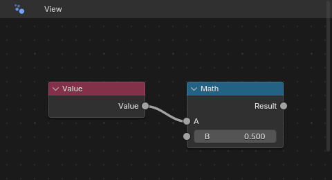
Editing works as in Blender: click selects (Shift toggles), drag moves the selection (Ctrl snaps), drag on empty space box-selects, drag from a socket to link, drag a linked input to pick its link up, and Ctrl+right-drag cuts links. Middle mouse pans, the wheel and Ctrl+middle mouse zoom, Ctrl+wheel and Shift+wheel pan, and Home frames everything.
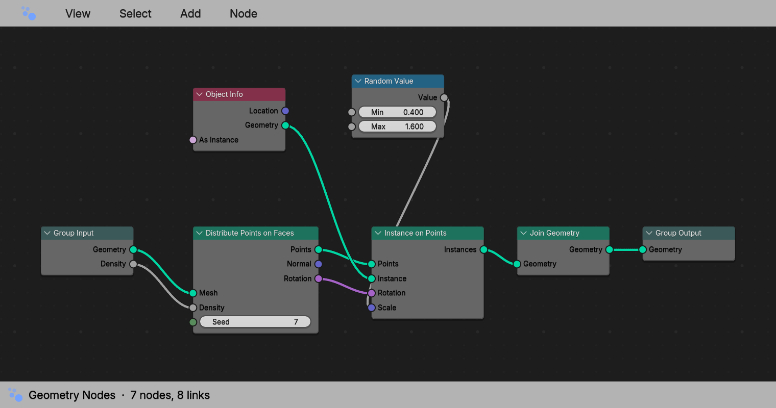
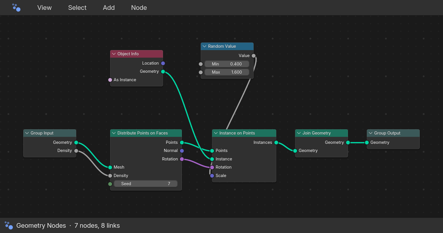
examples/site/geometry_nodes.py.Next steps
Last updated