
Your first app, in Rust
Build a counter with a heading, state and a real Blender slider, in rsx! markup or gpui-style builders. Native window, no browser.
- 15 minutes
- Beginner
- Rust
In this tutorial you’ll build a small Rust app with BUI: a heading, a counter with a hover effect, and one of Blender’s own number sliders. BUI draws it natively, in a real window, with no browser and no webview anywhere. About 40 lines.
BUI gives you two ways to write the same UI, and both are first-class. Every step below shows both; pick a tab and the whole page follows.
rsx!is HTML-like markup inside a macro:<div flex gap-3>"Add one"</div>. Components are functions with hooks for state.- gpui builders are plain method chains:
div().flex().gap_3().child("Add one"). State lives in your view struct, andcx.listenerupdates it. It’s the style of the gpui crate, so gpui code compiles against BUI too.
See it run first
If you have a clone of the repository, run the finished rsx! version before writing anything:
cd bindings/rustcargo run --release --example hello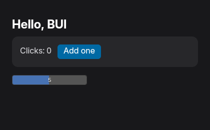
hello.rs, rendered headless with --screenshot.Click Add one a few times, then drag the slider. That slider is Blender’s: the cursor hides while you drag, Shift slows it down, and you can click it to type a value.
Build it yourself
-
Make a project and add BUI.
cargo new hello-buicd hello-buicargo add blenderuiThe crate is
blenderuion crates.io. -
Open a window with a view.
Replace
src/main.rswith this:src/main.rs use blenderui::prelude::*;struct Hello;impl Render for Hello {fn render(&mut self, _: &mut Window, _: &mut Context<Self>) -> impl IntoElement {rsx! {<body m-0 p-6 min-h-screen flex flex-col gap-4 bg-zinc-900 text-white><h1 text-2xl font-bold>"Hello, BUI"</h1></body>}}}fn main() {Application::new().run(|cx| {let opts = WindowOptions {window_bounds: Some(WindowBounds::Windowed(Bounds {origin: point(px(0.0), px(0.0)),size: size(px(420.0), px(260.0)),})),..Default::default()};cx.open_window(opts, |_, cx| cx.new(|_| Hello)).unwrap();});}rsx!is HTML-like markup. The macro turns it into ordinary Rust calls at compile time, so there’s no parsing at run time.- The bare words on each tag, like
p-6,flexandbg-zinc-900, are Tailwind classes written as attributes: short names for one style each (p-6is padding,bg-zinc-900a dark gray background). A typo such asbg-zinc-90Ois a compile error that suggests the right name. - Text goes in quotes:
"Hello, BUI".
src/main.rs use blenderui::prelude::*;struct Hello;impl Render for Hello {fn render(&mut self, _: &mut Window, _: &mut Context<Self>) -> impl IntoElement {body().m_0().p_6().css("min-height", "100vh").flex().flex_col().gap_4().bg(rgb(0x18181b)).text_color(white()).child(h1().text_2xl().font_bold().child("Hello, BUI"))}}fn main() {Application::new().run(|cx| {let opts = WindowOptions {window_bounds: Some(WindowBounds::Windowed(Bounds {origin: point(px(0.0), px(0.0)),size: size(px(420.0), px(260.0)),})),..Default::default()};cx.open_window(opts, |_, cx| cx.new(|_| Hello)).unwrap();});}- Every HTML element has a constructor:
body(),h1(),div(),span()and so on. They all return the sameDivtype. - Each style is a method:
.p_6()is padding,.flex().flex_col()stacks children in a column,.bg(rgb(0x18181b))sets the background. For anything without a method,.css("property", "value")sets any CSS property. .child(...)adds a child: another element, or text.
Run it with
cargo run --release. A dark window says hello.- A view is a struct that implements
Render. Itsrendermethod returns the UI. Application::new().run(...)starts the app, andcx.open_window(...)opens a 420 × 260 window showing your view. This part is the same in both styles.
-
Add a counter with state.
Add a component above
struct Hello:#[component]fn counter(label: &str) {let (count, set_count) = use_state(0);rsx! {<div flex items-center gap-3 p-4 rounded-xl bg-zinc-800><span text-zinc-300>{label.to_string()} ": " {count().to_string()}</span><div px-3 py-1 rounded-md bg-sky-700 hover:bg-sky-500 cursor-pointeronClick={move || set_count(count() + 1)}>"Add one"</div></div>}}#[component]turns the function into a component you can use as a tag. Its parameters become props:labelhere.use_state(0)is a hook: it keeps a value between renders. It gives you a getter,count(), and a setter,set_count(...). Calling the setter re-renders the window.{...}in markup inserts a Rust value. Text children areStringor&'static str, which is whylabeland the count go through.to_string().hover:bg-sky-500changes the color while the pointer is over the element.onClicktakes a closure, and you can leave out its parameters when you don’t need them.
Keep the count in the view itself. Give
Helloa field, and start it at zero inmain:struct Hello { count: i32 }// in main():cx.open_window(opts, |_, cx| cx.new(|_| Hello { count: 0 })).unwrap();Then build the counter in
render. It needs thecxparameter now, so give it a name:fn render(&mut self, _: &mut Window, cx: &mut Context<Self>) -> impl IntoElement {let counter = div().flex().items_center().gap_3().p_4().rounded_xl().bg(rgb(0x27272a)).child(span().text_color(rgb(0xd4d4d8)).child(format!("Clicks: {}", self.count))).child(div().px_3().py_1().rounded_md().bg(rgb(0x0369a1)).hover(|s| s.bg(rgb(0x0ea5e9))).cursor_pointer().child("Add one").on_click(cx.listener(|this, _, _, cx| {this.count += 1;cx.notify();})));// ... the body from step 2, with `.child(counter)` after the heading}- The view’s fields are its state.
self.countis read while rendering. cx.listener(...)wraps a closure so that, when it runs, it gets&mutaccess to your view (this). The other parameters are the event, the window and the context.cx.notify()tells BUI the view changed, so it renders again..hover(|s| ...)takes the styles to apply while the pointer is over the element.
-
Show the counter, and add a Blender slider.
Put two lines under the heading in
Hello’s markup:<body m-0 p-6 min-h-screen flex flex-col gap-4 bg-zinc-900 text-white><h1 text-2xl font-bold>"Hello, BUI"</h1><counter label="Clicks" /><NumberSlider min={0.0} max={10.0} value="5" /> // a real Blender slider</body><counter label="Clicks" />uses your component. Lowercase and uppercase component names both work.min={0.0}passes a Rust value;value="5"sets an HTML attribute.
Add two children after the heading:
body().m_0().p_6().css("min-height", "100vh").flex().flex_col().gap_4().bg(rgb(0x18181b)).text_color(white()).child(h1().text_2xl().font_bold().child("Hello, BUI")).child(counter).child(NumberSlider().min(0.0).max(10.0).value("5")) // a real Blender slider- Blender components are functions with capitalized names, like
NumberSlider(), and take the same methods as any element.
NumberSlideris one of BUI’s Blender components: capitalized names that are always Blender’s real widgets, never a look-alike. -
Run it.
cargo run --releaseThe
rsx!version is the wholehello.rsexample, minus its screenshot option. The builder version draws the same window.
What just happened
You described a tree of elements, and BUI did the rest:
rsx!or the builder chain built a tree of elements in plain Rust.- BUI turned the styles into CSS, laid the tree out with flexbox, and drew it natively.
- When you clicked, the new count was stored (by the hook, or in your view’s field) and the window rendered again, so the text changed.
- The slider isn’t drawn to look like Blender’s; it is Blender’s number slider, with Blender’s interaction rules.
Next steps
Last updated