
Effects and animations
Filters, blur behind glass, blend modes, clip paths, masks, transforms, border images, keyframe animations and transitions, with W3C formulas and zero idle cost.
- Rust
A frosted panel, a button that grows when you hover it, a spinner that never stops: standard CSS effects, animations and transitions work on BUI’s Rust side. The math follows the W3C specs, and a page that isn’t moving costs no CPU at all.
Effects at a glance
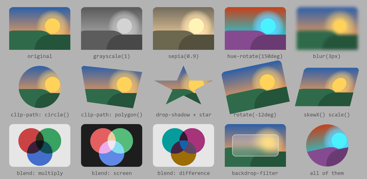
clip-path, 2D transforms, mix-blend-mode and backdrop-filter, drawn by BUI (examples/site_effects.rs)..glass { backdrop-filter: blur(8px) brightness(1.2) }.dim { filter: grayscale(1) opacity(0.6) }.ink { mix-blend-mode: multiply }.avatar { clip-path: circle(40%) }.fade { mask-image: linear-gradient(to right, #000, transparent) }.tilted { transform: rotate(-3deg) scale(1.05) }.framed { border: 10px solid; border-image: linear-gradient(#4772b3, #7a4fb3) 10 }Put any of these in a style() sheet, a .style(...) call, or the matching Tailwind classes, and they work as written.
Filters
filter and backdrop-filter take a list of these functions:
| Function | Effect |
|---|---|
blur(px) |
A Gaussian blur (three box-blur passes, the approximation browsers use) |
brightness(), contrast(), saturate() |
Light, contrast and color intensity |
grayscale(), sepia(), invert() |
Recoloring |
hue-rotate(deg) |
Rotate every hue |
opacity() |
Fade |
drop-shadow(x y blur color) |
A shadow that follows the shape’s pixels |
filter changes the element itself. backdrop-filter (and -webkit-backdrop-filter) changes what’s behind it: that’s the frosted-glass look.
Blend modes
mix-blend-mode supports all 16 modes, normal, multiply, screen, overlay, darken, lighten, color-dodge, color-burn, hard-light, soft-light, difference, exclusion, hue, saturation, color and luminosity, plus plus-lighter. isolation works too.
An element blends with whatever was painted before it; blending across stacking contexts is Coming soon.
Clip paths and masks
clip-path:inset(),circle(),ellipse(),polygon(), and reference boxes.path()is Coming soon.mask/mask-image: gradients and PNGs, as alpha or luminance, withmask-size,mask-positionandmask-repeat.clip: rect(...)works on absolutely positioned boxes, as in CSS 2.1.
Transforms
Every 2D transform draws: translate, scale, rotate, skew, matrix, with transform-origin, and the individual rotate, scale and translate properties.
#bar { transform: rotate(90deg) } /* about its center, by default */#badge { scale: 2 }#card { transform: skewX(12deg) }Borders, outlines and decorations
These render too, beyond solid lines:
- Every
border-styleandoutline-style:dashed,dotted,double,groove,ridge,inset,outset. They follow rounded corners, using Blender’s corner tessellation. border-image: gradients and PNGs, withslice,width,outset,stretch/repeat/round/space, andfill. It draws the nine slices.- Text decoration:
text-decoration-style(includingwavy),text-decoration-thicknessandtext-underline-offset. - Backgrounds:
background-clipandbackground-origin(border-box,padding-box,content-box),background-attachment: fixed, andbackground-image: url()(PNG) withbackground-size,background-position(and-x/-y) andbackground-repeat. - Generated content: counters (
counter-reset,counter-increment,counter-set, withcounter()andcounters()incontent),empty-cells,list-style-image.
How effects are drawn
The element’s subtree is drawn offscreen with the canvas’ own drawing code, then filtered, clipped, masked and resampled (bilinear, like Blender’s image transform), then composited back with the W3C formulas. This works the same on the CPU and GPU renderers.
The result is cached by content, so a page that doesn’t change costs nothing, however many effects it has.
Animations
@keyframes animations run like a browser’s:
use blenderui::prelude::*;
const CSS: &str = "@keyframes pulse { 50% { opacity: 0.4; transform: scale(0.95) } }.saving { animation: pulse 1.2s ease-in-out infinite }";
struct Saving;
impl Render for Saving {    fn render(&mut self, _: &mut Window, _: &mut Context<Self>) -> impl IntoElement {        body().styled().child(style().child(CSS))            .child(div().class("saving").p_4().child("Saving…"))    }}
fn main() {    Application::new().run(|cx| {        cx.open_window(WindowOptions::default(), |_, cx| cx.new(|_| Saving)).unwrap();    });}
What’s supported:
- Keyframes: percentage lists,
from/to,@keyframesinside@media, and a per-keyframeanimation-timing-function. When a name is defined twice, the last matching block wins. - Every
animation-*longhand and theanimationshorthand: lists of animations, negative delays,infinite, every direction, fill mode and play state. - Each element keeps its own clock. Two elements with the same rule, added at different times, animate independently.
- Tailwind’s
animate-spin,animate-ping,animate-pulseandanimate-bouncecome with their keyframes.
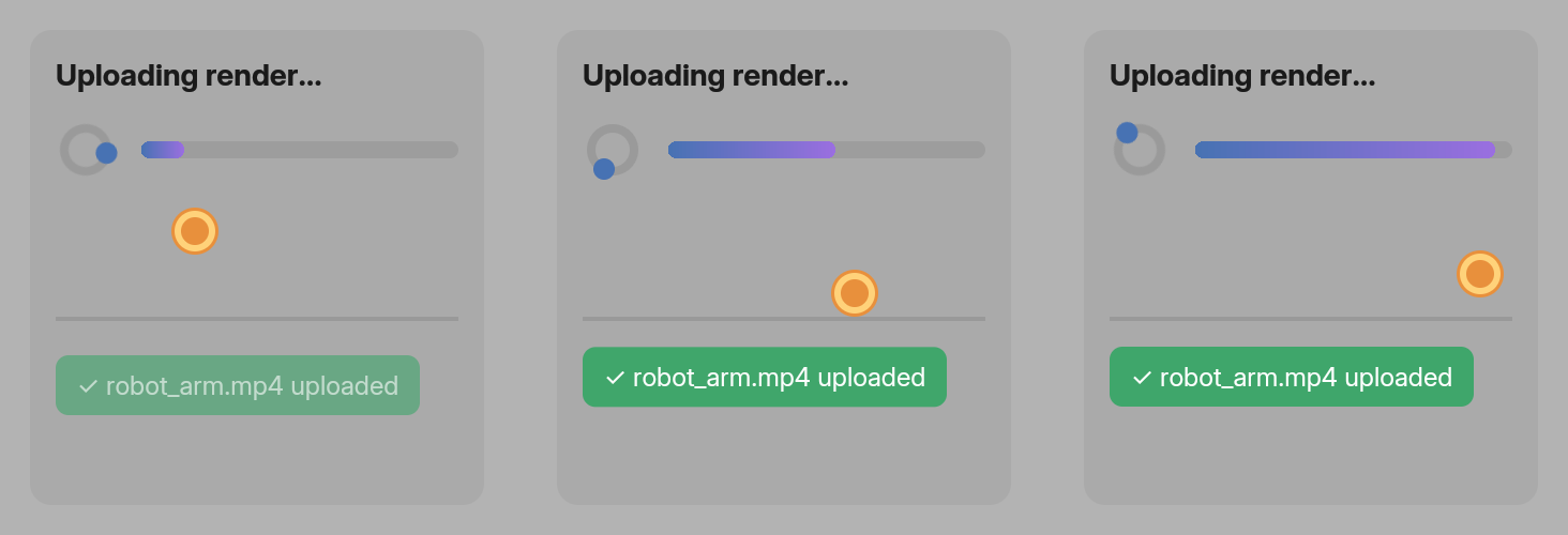
@keyframes at 0.25 s, 0.6 s and 1.0 s, captured with the headless virtual clock (examples/site_animation.rs).Transitions
transition and its longhands animate a property when its value changes, for example on :hover:
#tile { width: 100px; background: rgb(255, 0, 0); transition: width 1s linear, background-color 1s linear }#tile:hover { width: 200px; background: rgb(0, 0, 255) }allor a list of properties, andtransition-behavior: allow-discrete.- Interrupted transitions start from the current value. Leave a hover halfway, and the box shrinks back from where it is.
- A transition sent back to where it came from takes only as long as it ran. Half a second out means half a second back.
Easing
linear, ease, ease-in, ease-out, ease-in-out, cubic-bezier(), steps() with every jump position (jump-start, jump-end, jump-none, jump-both), step-start, step-end, and linear() with points.
What animates smoothly
These interpolate:
- lengths, percentages and numbers,
- colors (in premultiplied sRGB, as browsers do),
box-shadowandtext-shadow,transform(function by function),rotate,scale,filterandbackdrop-filter(function by function),visibilityandz-index.
Every other property flips at the halfway point.
Zero cost when still
A window renders frames only while something moves. Finished or paused animations cost no CPU, and transitions alone don’t wake anything until a value actually changes. You can check from code: window.is_animating() is true while CSS animations or transitions run.
Headless windows run on a virtual clock that moves only when you call cx.advance_clock(duration), so tests can step animations exactly. Headless testing shows how.
For animations driven by your own code instead of CSS, call window.request_animation_frame() from render: the window renders again on the next display refresh. See Events.
Not done yet
Next steps
Last updated