
rsx! and components
Write your UI as HTML-like markup in Rust, or as gpui-style builder chains, split it into function components with typed props, and let the compiler catch the mistakes.
- Rust
rsx! lets you write HTML-like markup right in your Rust code, with loops, conditions and components, and the compiler checks every piece of it.
There’s no runtime parser. rsx! is lowered to ordinary builder calls when your program compiles, so <div class="p-4"> costs exactly what div().class("p-4") costs. Those builder calls are the other first-class way to write a BUI UI, gpui builders: method chains in the style of the gpui crate. This page shows both side by side; use whichever you prefer, or mix them. view! is the same macro as rsx! under its Leptos and zopra name.
A first taste
The same to-do view, written both ways. The tabs remember your choice across the Rust pages.
use blenderui::prelude::*;
struct Todo {    items: Vec<String>,    done: bool,}
impl Render for Todo {    fn render(&mut self, _: &mut Window, cx: &mut Context<Self>) -> impl IntoElement {        let items = self.items.clone();        rsx! {            <div class="flex flex-col gap-2 p-4">                <h1 style="color: #e6a23c">"Today: " {items.len().to_string()} " things"</h1>                <ul>{for it in items { <li>{it}</li> }}</ul>                {if self.done { <p>all done</p> }}                <button onClick={cx.listener(|this, _: &ClickEvent, _, cx| {                    this.done = true;                    cx.notify();                })}>"Finish"</button>            </div>        }    }}
fn main() {    Application::new().run(|cx| {        cx.open_window(WindowOptions::default(), |_, cx| {            cx.new(|_| Todo { items: vec!["Model".into(), "Render".into()], done: false })        }).unwrap();    });}
Everything inside the braces is just Rust: {items.len().to_string()} is an expression, {for ...} is a loop, cx.listener is the usual listener.
use blenderui::prelude::*;
struct Todo {    items: Vec<String>,    done: bool,}
impl Render for Todo {    fn render(&mut self, _: &mut Window, cx: &mut Context<Self>) -> impl IntoElement {        div().class("flex flex-col gap-2 p-4")            .child(h1().style("color: #e6a23c").child(format!("Today: {} things", self.items.len())))            .child(ul().children(self.items.iter().map(|it| li().child(it.clone()))))            .when(self.done, |el| el.child(p().child("all done")))            .child(button().child("Finish").on_click(cx.listener(|this, _: &ClickEvent, _, cx| {                this.done = true;                cx.notify();            })))    }}
fn main() {    Application::new().run(|cx| {        cx.open_window(WindowOptions::default(), |_, cx| {            cx.new(|_| Todo { items: vec!["Model".into(), "Render".into()], done: false })        }).unwrap();    });}
Each tag is a function (div(), ul(), li()), each attribute a method (.class(...), .style(...)), and .child(...) / .children(...) add what goes inside. .when(condition, ...) adds something only when the condition holds.
Text and children
- Quoted text is a child:
<h1>"Hello, " {name}</h1>. - Bare words work too.
<p>all done</p>becomes the text"all done"; the words are joined with single spaces, and punctuation sticks to the word before it. Quote anything that has to stay exact. {expr}adds any value that turns into an element: text (&'static str,String,SharedString), an element or a component. Numbers aren’t text on their own, so write{count.to_string()}.{...iter}adds every item of an iterator:{...self.children}. In builder style, that’s.children(iter).
Attributes
rsx! applies one uniform rule, so the whole element API is reachable from markup:
| You write | It becomes |
|---|---|
<div>, <section> … |
html::div(), html::section() … |
<my-widget> |
Div::new("my-widget"), a custom element |
name="text" |
.attr("name", "text"), an HTML attribute |
class="…", style="…", id="…" |
.class(…), .style(…), .id(…) |
className="…" |
.class(…) |
name={expr} |
.name(expr), the builder method of that name |
type={expr} |
.input_type(expr) |
data-x={expr}, for={expr} |
.attr("data-x", expr), .attr("for", expr) |
disabled, checked, open (bare) |
.attr("disabled", ""): HTML boolean attributes stay attributes |
p-4, hover:bg-sky-500 (bare) |
Tailwind classes (below) |
Because name={expr} calls any method, typed styling works too: w={px(10.0)} calls .w(px(10.0)), and hover={|s| s.bg(red())} calls .hover(...). CamelCase names become snake_case: onMouseMove calls .on_mouse_move.
For anything else, pass a builder closure where an attribute would go. It receives the element and returns it:
rsx! { <div {|el| el.w(px(3.0)).when(wide, |el| el.h(px(20.0)))} /> }Event handlers
onClick={...} becomes .on_click(...), and the same for every on* listener. Listeners take three parameters, (event, window, cx), but in rsx! you can leave out the ones you don’t need. The macro fills the rest with _:
rsx! { <div onClick={|| println!("clicked")} /> // no parameters <input onChange={|e: &ChangeEvent| println!("{}", e.value)} /> // just the event <div onClick={cx.listener(|this, _: &ClickEvent, _, cx| cx.notify())} /> // a path or call: as is}The events page lists every listener and its event type.
Control flow
All three forms go inside braces, and their bodies can be markup directly.
rsx! {    <ul>{for it in items { <li>{it}</li> }}</ul>
    {if count == 0 { <p>"Nothing yet"</p> } else if count == 1 { <p>"One"</p> } else { <p>"Many"</p> }}
{match mode { Mode::A => <A />, Mode::B => <span>"b"</span>, }}}formaps each item to markup. The closure ismove, so clone what you need first.ifwithout anelserenders nothing when the condition is false.matcharms can be markup, a{ block }that ends in markup, or any expression.
Fragments
<>...</> groups children without adding a box. It’s an element with display: contents, so its children lay out as if they belonged to the parent. When rsx! contains more than one top-level node, it wraps them in a fragment for you.
rsx! { <> <h2>"Title"</h2> <p>"Body"</p> </>}Tailwind as attributes
Tailwind utilities can be written as bare attributes. They become classes at compile time:
rsx! { <div p-4 w-1/2 bg-[#4772b3] hover:bg-sky-500/50 md:flex -mt-2 text-sm/6 /> }HTML boolean attributes (disabled, checked, hidden, open …), data-* and aria-* stay attributes, even where Tailwind has a utility of the same name (hidden). Anything that looks like a utility but isn’t one is a compile error that suggests the fix. Every Tailwind variant also works as an attribute prefix: hover:class="...", md:dark:hover:style="...", active:bg={rgb(0x4772b3)}. All of this is on the CSS and Tailwind page.
Components
A component is a reusable piece of UI with its own inputs (props) and, if it likes, its own state. Put #[component] on a function and use it as a tag:
use blenderui::prelude::*;
#[component]fn counter(label: &str) {    let (count, set_count) = use_state(0);    rsx! {        <div flex items-center gap-3 p-4 rounded-xl bg-zinc-800>            <span text-zinc-300>{label.to_string()} ": " {count().to_string()}</span>            <div px-3 py-1 rounded-md bg-sky-700 hover:bg-sky-500 cursor-pointer                 onClick={move || set_count(count() + 1)}>                "Add one"            </div>        </div>    }}
struct Hello;
impl Render for Hello {    fn render(&mut self, _: &mut Window, _: &mut Context<Self>) -> impl IntoElement {        rsx! {            <body m-0 p-6 min-h-screen flex flex-col gap-4 bg-zinc-900 text-white>                <h1 text-2xl font-bold>"Hello, BUI"</h1>                <counter label="Clicks" />                <NumberSlider min={0.0} max={10.0} value="5" />   // a real Blender slider            </body>        }    }}
fn main() {    Application::new().run(|cx| {        cx.open_window(WindowOptions::default(), |_, cx| cx.new(|_| Hello)).unwrap();    });}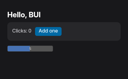
examples/hello.rs (cargo run --release --example hello).What #[component] does with your function:
- It becomes a struct with the same name. Each parameter is a public field, so
fn counter(label: &str)givesstruct counter { pub label: String }, plus a props builder thatrsx!uses. - Upper- and lowercase names both work.
fn Counterandfn profileare both fine. A lowercase tag inrsx!that isn’t an HTML element is treated as a component, so give lowercase components names that aren’t HTML tags (profile, notheader). &strprops are stored asString, and your function body still sees a&str. Other borrowed types are a compile error: “use an owned type”.- The body is a normal block that ends in markup, usually an
rsx!. - Hooks and context work inside it, scoped to that component: see Hooks and signals.
Passing props
label="Clicks"passes a literal. Prop setters takeimpl Into<T>, so a string literal works for aStringprop.start={1}passes an expression. Number andboolprops take their exact type, so integer literals infer correctly.- Boolean shorthand: a bare
<toggle on />passestrue.
Optional props
Make a prop an Option<T> and callers may leave it out; it’s None. children may be left out too.
#[component]fn Row(name: &str, note: Option<String>) {    let note = note.unwrap_or_default();    rsx! { <div data-note={note}>{name.to_string()}</div> }}
// both compile:rsx! { <Row name="a" /> }rsx! { <Row name="b" note={"plain".to_string()} /> }
Leaving out any other prop is a compile error that names the missing one:
error: a required prop is missing: ... Row_missing_nameChildren
Add a children: Children prop and whatever you put between the tags arrives there. Children is a Vec<AnyElement>; spread it with {...children}:
#[component]fn Card(title: &str, children: Children) {    rsx! {        <section class="p-2">            <h2>{title.to_string()}</h2>            {...children}        </section>    }}
rsx! { <Card title="Settings"><p>"Inside the card"</p></Card> }
Keys
A component’s state is tied to its position among its siblings. In a list that changes, give each component a key so its state follows the item instead:
rsx! { <ul>{for item in items { <Row key={item.id} name={item.name.clone()} /> }}</ul>}Without keys, removing the first item hands its state to the next one. The hooks page shows it happening.
Struct components
You can also write a component as a struct that implements IntoElement. Add #[derive(Props)] and rsx! gets the same builder: optional Option<T> fields, optional children, and the same “missing prop” errors.
#[derive(Props)]struct Card {    title: SharedString,    children: Vec<AnyElement>,}
impl IntoElement for Card {    fn into_any_element(self) -> AnyElement {        rsx! {            <section class="p-2">                <h2>{self.title.clone()}</h2>                {...self.children}            </section>        }        .into_any_element()    }}
Three component styles
BUI speaks three dialects of the same idea. Mix them freely; they share one hook store.
| Style | Looks like | State |
|---|---|---|
| zopra | #[component] fn profile(username: &str), <profile username="Ada" /> |
let (likes, set_likes) = use_state(0), then likes() and set_likes(..) |
| Hooks with dependency lists | the same components | use_state, use_effect(f, deps), use_memo(f, deps) |
| Leptos | #[component] fn Counter(start: i32), view! { ... } |
signal, Memo::new, Effect::new, provide_context |
Reusable pieces in builder style
In builder style, a reusable piece of UI is a plain Rust function that returns an element. Its parameters are its props, and its state lives in the view that calls it:
fn card(title: &str, body: impl IntoElement) -> Div {    section().p_2().child(h2().child(title.to_string())).child(body)}
// in render():div().child(card("Settings", p().child("Inside the card")))
Keep the state in your view’s fields and pass what the piece needs as arguments; listeners made with cx.listener(...) update the view. The gpui syntax page covers views, entities and listeners in full. When you want a piece that carries its own hook state, write it as a #[component] and drop an rsx! into the chain: .child(rsx! { <counter label="Clicks" /> }).
When it doesn’t compile
rsx! reports problems as ordinary compile errors, pointing at your markup:
rsx!: <div> closed by </span>andrsx!: <ul> is never closedfor mismatched tags.rsx!: `bg-sky-50O` is not a Tailwind utility; did you mean `bg-sky-500` or `bg-sky-50` or `bg-sky-100`?for a misspelled utility.a required prop is missingfor a component, naming the prop.#[component]: generic components are not supported; use concrete prop types.- A typed value under a variant other than
hover,activeorfocussuggestsvariant:classorvariant:styleinstead.
And because the output is plain method calls, a wrong attribute (<div widht={...}>) is the compiler telling you Div has no method widht.
Limitations
- Generic components (
fn list<T>(...)) are Coming soon. Use concrete prop types for now. - Async resources (
use_resource) are Coming soon too; see Hooks and signals.
Next steps
Last updated