
Blender widgets for Dear ImGui
One build flag turns Dear ImGui's widgets into Blender's own, drawn by BUI and handled with Blender's rules. What changes, the full mapping, and the gaps.
- C++
- C
- Python
- Rust
- Dear ImGui
The Blender theme makes ImGui look like Blender. The Blender-widgets build makes it feel like Blender. Turn on one option and ImGui::SliderFloat becomes Blender’s number slider: drag it relative to where you pressed, hold Shift for precision, hold Ctrl to snap, click to type a value. Your ImGui code doesn’t change at all.
These aren’t look-alikes. BUI draws them with the same code as its own native widgets, a port of Blender’s interface_widgets.cc, and a test checks they’re the same pixels.
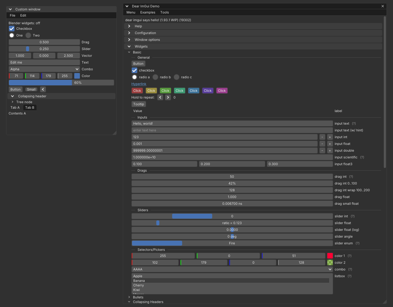
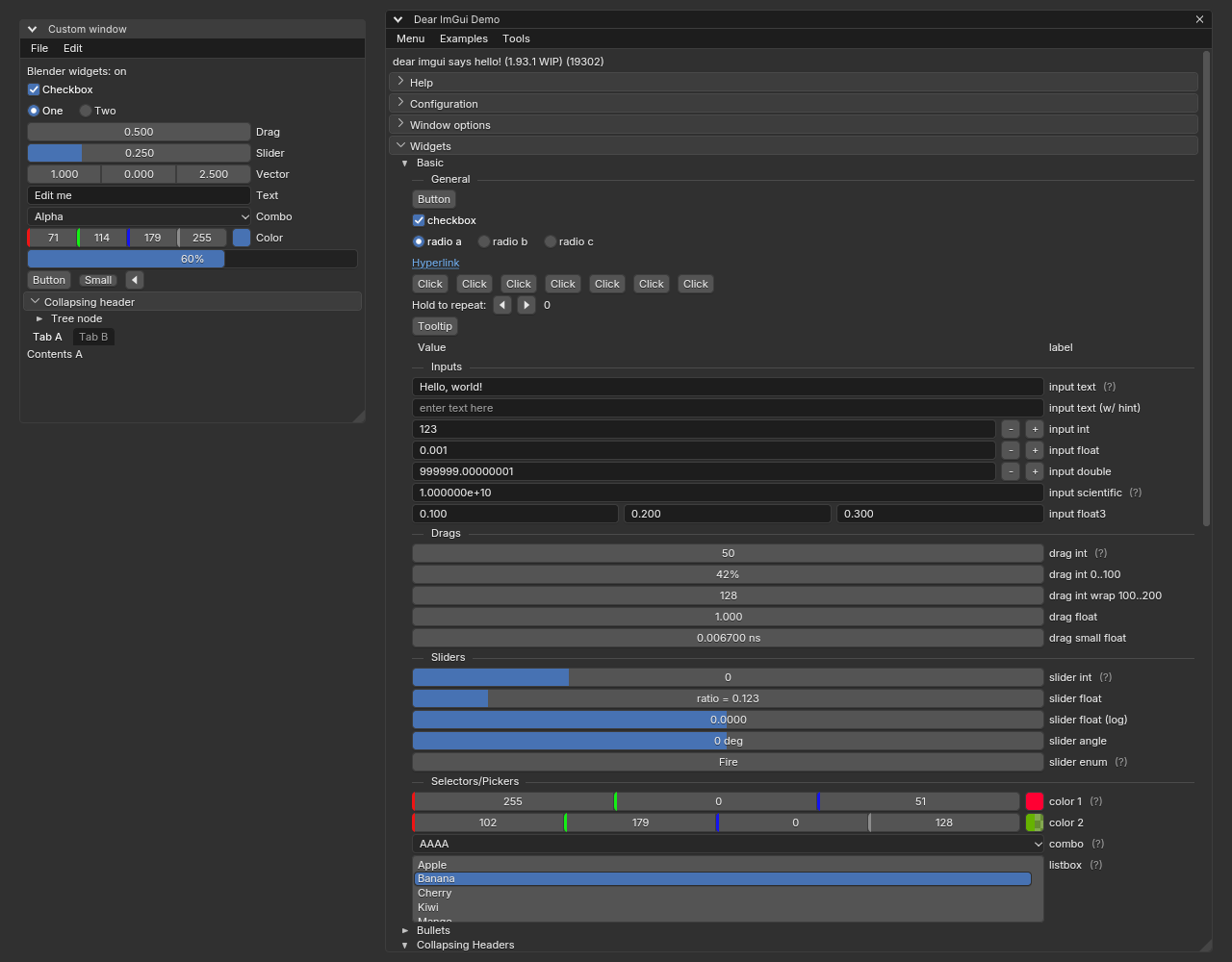
Look at the Vector row: three separate boxes on the left, one joined row on the right, the way Blender aligns X/Y/Z fields. The Slider has a fill bar instead of a grab handle, and the checkboxes and radio buttons are Blender’s.
Turn it on
cmake -S . -B build -DBUI_IMGUI_BLENDER_WIDGETS=ONThe option is off by default. It changes bui::imgui and bui::cimgui, so link as usual.
cmake -S . -B build -DBUI_IMGUI_BLENDER_WIDGETS=ONThe same option builds bui::cimgui with Blender’s widgets.
[dependencies]blenderui-imgui = { git = "https://github.com/ppmpreetham/BUI", features = ["blender-widgets"] }Build BUI from source with -DBUI_IMGUI_BLENDER_WIDGETS=ON. The wheels on PyPI are built without it, so pip install blenderui gives you ImGui’s own widgets in Blender’s theme.
When the build has them, they’re on by default. You can switch at runtime, for example to compare:
| C++ | C | Python | Rust | |
|---|---|---|---|---|
| Built with them? | ImGui_ImplBUI_HasBlenderWidgets() |
cImGui_ImplBUI_HasBlenderWidgets() |
imgui.has_blender_widgets() |
has_blender_widgets() |
| In use? | ImGui_ImplBUI_GetBlenderWidgets() |
cImGui_ImplBUI_GetBlenderWidgets() |
imgui.get_blender_widgets() |
blender_widgets() |
| Switch | ImGui_ImplBUI_SetBlenderWidgets(on) |
cImGui_ImplBUI_SetBlenderWidgets(on) |
imgui.set_blender_widgets(on) |
set_blender_widgets(on) |
Switching off goes back to ImGui’s own drawing and interaction.
What feels different
If you know ImGui, these are the changes your hands will notice:
- Sliders don’t jump. A press doesn’t move the value; dragging changes it relative to where you pressed. A click without a drag lets you type a value. (ImGui jumps to the pointer on press.)
- Number fields (
Drag*) type on click. A click without a drag types a value; ImGui needs Ctrl+click, a double-click orio.ConfigDragClickToInputText. The arrows at each end step the value. The drag starts after 0.25 widget units. - Shift is slower, not faster. It’s Blender’s precision mode, 10× slower on number fields and 20× on sliders. (ImGui: Shift faster, Alt slower.) Ctrl snaps while you drag.
- Checkboxes toggle on press, and you can drag across several to give them all the same state. (ImGui toggles on release.)
- A quick second press is a new drag, not a double-click.
- Text fields put their text 0.4 widget units from the left edge, as Blender does.
- Menu check marks are Blender’s check box, in ImGui’s mark column (Blender puts the box on the left).
Logarithmic sliders and drags, reversed slider ranges, the keyboard and gamepads keep ImGui’s interaction, drawn as Blender widgets.
The mapping
| ImGui | Drawn as | Interaction |
|---|---|---|
Button, SmallButton |
Push button, label centred | ImGui’s (press on release) |
ArrowButton |
Push button with a triangle | ImGui’s |
InvisibleButton |
Nothing | ImGui’s |
Checkbox, CheckboxFlags |
Option box and label; a dash when mixed | Blender’s: toggles on press, drag-toggle |
RadioButton |
A round option with a dot (Blender’s own “radio” is a segmented row) | ImGui’s |
Selectable |
List row; menu row in popups; pulldown in menu bars | ImGui’s |
DragFloat, DragInt, DragScalar (and N, Range2) |
Number field with step arrows on hover | Blender’s: scrub, Shift 1/10, Ctrl snaps, arrows step, click types, Esc reverts |
SliderFloat, SliderInt, SliderScalar (and N), SliderAngle |
Number slider: fill bar, value inside | Blender’s: relative drag, Shift 1/20, Ctrl snaps, click types |
VSliderFloat, VSliderInt, VSliderScalar |
ImGui’s vertical slider (Blender has none), Blender colours | ImGui’s |
InputText, InputTextWithHint, InputFloat, InputInt … |
Text field; the +/- are Blender buttons | ImGui’s text engine |
InputTextMultiline |
Text field backdrop | ImGui’s |
Combo, BeginCombo |
Menu button with the pulldown arrows; the popup is Blender’s menu, shadow included | ImGui’s |
ColorButton, ColorEdit3, ColorEdit4 |
Colour swatch (checker under the alpha half); components as a joined row of number fields | Blender’s number fields |
ColorPicker3, ColorPicker4 |
ImGui’s picker, Blender colours | ImGui’s |
ProgressBar |
Progress bar, text centred | |
CollapsingHeader, framed TreeNode |
Panel header: arrow icon, title with its soft shadow | ImGui’s |
TreeNode |
Tree row with a disclosure triangle | ImGui’s |
BeginTabBar, BeginTabItem |
Blender’s tabs | ImGui’s |
BeginMenuBar, BeginMenu |
Pulldowns in the bar; Blender’s menu with shadow, rows and submenu arrows | ImGui’s |
MenuItem |
Menu row, shortcut at 55% text alpha; selected shows Blender’s check box |
ImGui’s |
Separator, SeparatorText |
ImGui’s line in Blender’s separator colour | |
Text, LabelText, BulletText, TextWrapped … |
BUI’s text (Inter), ImGui’s wrapping | |
Windows, title bars, tooltips, BeginPopup popups, tables, scrollbars, plots |
ImGui’s, in the Blender style | ImGui’s |
Two layout details:
- “Label: value” formats. A number field or slider whose format contains a
:(like"Width: %.0f", or ColorEdit’s"R:%3d") shows Blender’s way: label on the left, value on the right. Other formats are centred. ImGui’s ownlabelargument stays outside, on the right, so layouts and label columns keep working. - Joined rows. The components of
DragFloat2/3/4,DragInt*,SliderFloat2/3/4,SliderInt*,Drag*Range2andColorEditjoin into one rounded row, as Blender aligns vectors.
How it works
- A drop-in copy.
blender/imgui_widgets_blender.cppis a copy of ImGui’simgui_widgets.cpp, and CMake compiles it instead of the original. Same functions, same ABI, so every binding gets Blender widgets with no change. Every edit in it is markedBUI:. - ImGui’s logic is untouched. Items, IDs, layout, navigation and the text-editing engine are ImGui’s own. What changes is how each widget is drawn and, for number fields, sliders and checkboxes, how the mouse drives it.
- Drawn by the kit. Each widget becomes a draw-list callback. While rendering, the backend hands it to the kit’s
BK_draw_widget, the same drawing BUI’s native widgets use, clipped as ImGui asked. - Same pixels, proven. The test
imgui_blender_widgets_match_kitrenders nine kit widgets next to the same widgets through ImGui and requires them to match exactly at scale 1. - Still idle when idle. The callback data is part of the backend’s change check, so “redraw only on change” still works, on the CPU and the GPU.
Gaps
Honest list. These keep ImGui’s behaviour or drawing for now:
- Blender’s vertical multi-value drag (drag down over fields, then sideways) and Alt (edit all linked fields) aren’t implemented. The cursor isn’t hidden and wrapped while you scrub. Coming soon
- Window title bars and frames, tooltips,
BeginPopupand context-menu backgrounds, table headers keep ImGui’s rendering in the Blender style. Only combos andBeginMenumenus get Blender’s menu backdrop. ColorPicker3/4keeps ImGui’s drawing: the Blender-widgets build doesn’t route it to Blender’s color picker yet. So doVSlider*,PlotLines,PlotHistogram,ImageButton,BulletandTextLink.- Text being typed uses ImGui’s glyphs, because ImGui measures its cursor and selection with them.
- An indeterminate
ProgressBar(a negative fraction) shows the moving end of ImGui’s segment.
Next steps
Last updated