
Layout
Block flow, wrapping text, flexbox, grid with named areas, tables, positioning, scrolling and right-to-left text, laid out by taffy like a browser would.
- Rust
Getting boxes to sit where you want is most of UI work. BUI lays out your elements with the CSS layout rules: block flow, flexbox, grid and tables, following the W3C specs. Under the hood it’s taffy, the Rust layout engine, with BUI’s own line boxes and tables on top.
Block flow
Elements like div, p and section stack top to bottom, as in a browser. Margins, padding, borders, box-sizing, min-* / max-* sizes and aspect-ratio all apply, and so do sizing keywords such as fit-content and stretch.
Floats place block boxes to the left or right, and clear moves the next box below them. Text doesn’t wrap around floats yet Coming soon.
Inline text
Text and inline elements become line boxes: words that wrap at the container’s edge. Inline elements (b, a, code, mark …) style their own words, and inline-blocks and widgets sit on the line with the text.
These apply to inline content:
white-space:normal,nowrap,pre,pre-wrap,pre-linetext-align,text-indent,letter-spacing,word-spacingvertical-align: sub | super,text-transform,text-overflow: ellipsisword-break: break-all,overflow-wrap: anywhere | break-word,tab-size
text-align: justify aligns left for now Coming soon.
Flexbox and grid
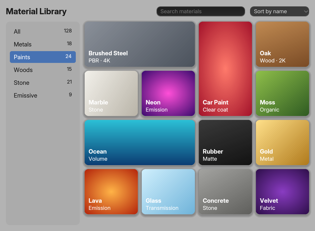
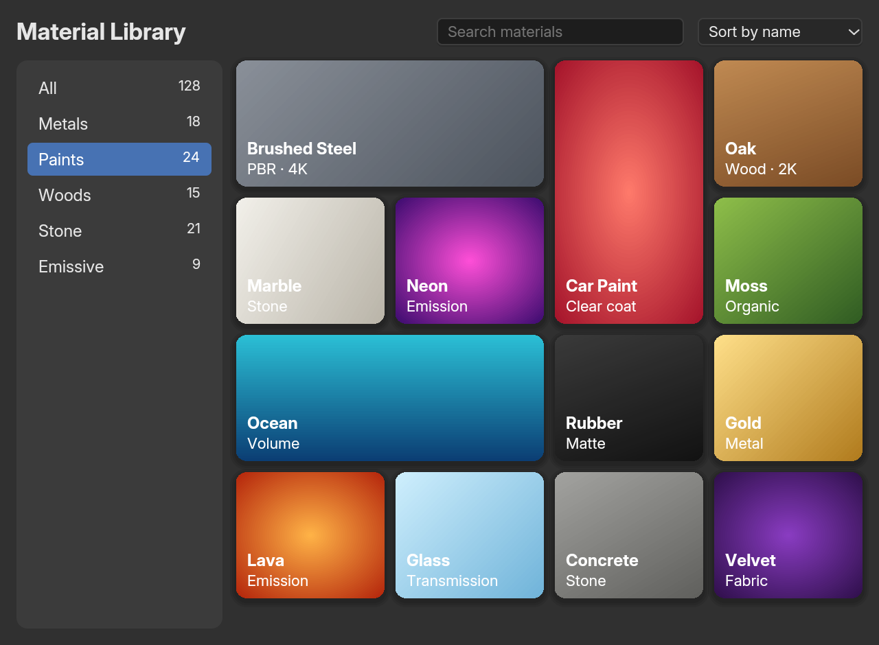
repeat(auto-fill, minmax()), row and column spans and grid-auto-flow: dense (examples/site_grid.rs).Every property of both modules works: Flexbox 12 of 12 and Grid 23 of 23. That includes repeat(), minmax(), fr, auto-fill / auto-fit, spans, line placement, named lines and grid-template-areas.
use blenderui::prelude::*;
struct Shell;
impl Render for Shell {    fn render(&mut self, _: &mut Window, _: &mut Context<Self>) -> impl IntoElement {        body().m_0().styled()            .child(style().child("                .g { display: grid; height: 100vh;                     grid-template-columns: 160px 1fr;                     grid-template-rows: 40px 1fr 30px;                     grid-template-areas: 'head head' 'side main' 'foot foot' }                header { grid-area: head } nav { grid-area: side }                .main { grid-area: main } footer { grid-area: foot }"))            .child(div().class("g")                .child(header().child("Header"))                .child(nav().child("Outliner"))                .child(div().class("main").child("Viewport"))                .child(footer().child("Status bar")))    }}
fn main() {    Application::new().run(|cx| {        cx.open_window(WindowOptions::default(), |_, cx| cx.new(|_| Shell)).unwrap();    });}
The same layouts work with methods (div().flex().flex_col().gap_2(), div().grid().grid_cols(3)) or Tailwind (class="grid grid-cols-3 gap-4").
Tables
Tables lay out like a browser’s auto layout:
- Columns are as wide as their widest content and line up across rows.
- A table with an auto width shrinks to its columns, up to the width of its container.
table-layout: fixedtakes the column widths from the first row.colspan,border-spacing,border-collapse,caption-sideandempty-cellsapply.
table().style("border-collapse: collapse; width: 100%") .child(thead().child(tr().child(th().child("Object")).child(th().child("Type")))) .child(tbody() .child(tr().child(td().child("Cube")).child(td().child("Mesh"))) .child(tr().child(td().child("Camera")).child(td().child("Camera"))))One simplification: columns are sized from their widest single-line content, a simpler version of browsers’ auto layout.
Positioning
relativeandabsolute, with everyinsetproperty (top,left,inset-inline-start…). An absolute box is placed against its nearest positioned ancestor.fixedboxes are laid out likeabsoluteones, placed against the window.z-indexorders painting and hit testing.- 2D transforms (
translate,scale,rotate,skew,matrix,transform-origin, and the individualrotate,scaleandtranslateproperties) all draw. Clicks still use the untransformed box. See Effects.
Overflow and scrolling
overflow: hiddenandclipclip their content.overflow: scrollandautoscroll with the mouse wheel (hold Shift to scroll sideways) and show overlay scrollbars.- Give a scroll container an
.id(...)and its scroll position survives re-renders. Read or set it from code withwindow.scroll_offset(id)andwindow.set_scroll_offset(id, x, y).
Scroll snapping
scroll-snap-type (x, y or both; mandatory or proximity) on the container and scroll-snap-align on its children make scrolling land on a child:
#pages { height: 100px; overflow-y: scroll; scroll-snap-type: y mandatory }.page { height: 100px; scroll-snap-align: start }With that, one wheel notch moves exactly one page. scroll-padding, scroll-margin and scroll-snap-stop parse but aren’t applied yet.
Container queries
@container size queries work, with container-type and container-name:
.sidebar { container: side / inline-size }@container side (max-width: 150px) { .label { display: none } }Queries use the container’s size from the previous layout. When that size changes, the window simply renders once more.
Right-to-left text
Hebrew and Arabic runs are reordered inside left-to-right text, using a compact version of the Unicode Bidirectional Algorithm. direction: rtl and unicode-bidi: bidi-override apply.
Lists, details and dialogs
- Lists:
list-style-type(disc,circle,square,decimal,lower-alpha,upper-roman…),list-style-position,list-style-imageand<ol start>. <details>/<summary>: clicking the summary toggles the details;.open(true)sets the starting state.<dialog>shows when you give it.open(true).
How it’s fast
Your render() builds a fresh element tree every frame, but layout doesn’t start from zero. The taffy tree persists between frames and is reconciled by key, so only subtrees that changed are laid out again. The repository’s tests check that an incrementally updated frame matches a fresh render pixel for pixel.
Next steps
Last updated