
Blender components
Build Blender-style tools in Python from Blender's own widgets, layouts, menus and editors. Learn the App, the API every component shares, layout, and menus.
- Python
blenderui.components is Blender’s interface as a Python library: the panels, number fields, sliders, menus and editors of Blender’s properties editor and outliner, with Blender’s rules for how they behave. If you’re building a tool for people who know Blender, their hands will already know your UI.
Each component is a node of BUI’s C runtime, the kit. Python builds the tree and receives callbacks; layout, input and drawing all run in C. That’s why an idle window costs nothing, and dragging a slider redraws only the slider.
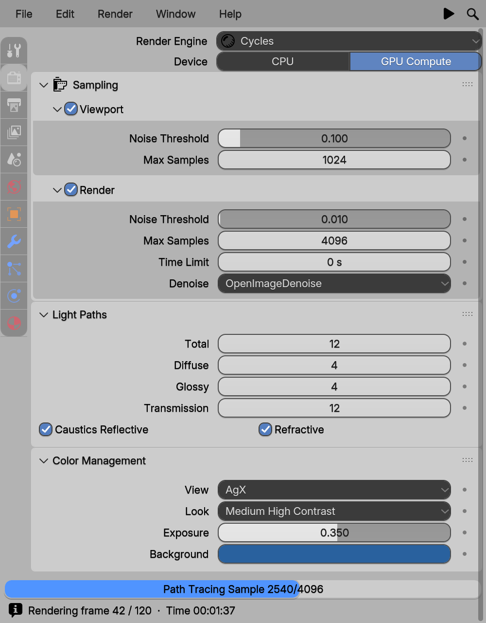
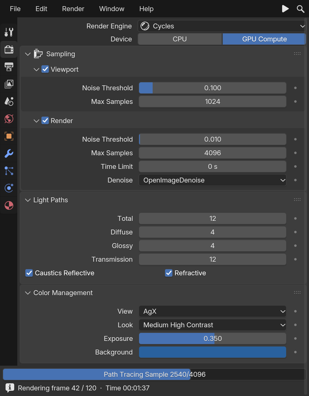
examples/site/render_props.py: Blender components, laid out like Blender's properties editor.Hello, components
from blenderui.components import App, Panel, NumberSlider, Checkbox, Button
def on_size(value):    print("size is now", value)
App("Demo", (360, 260),    Panel("Object",          NumberSlider("Size", 1.0, min=0, max=10, on_change=on_size,                       description="Object size"),       # the tooltip          Checkbox("Smooth", True),          Button("Apply", on_click=lambda: print("apply"))),).run()
New to this? The first-app tutorial builds a window like this one line at a time.
The App
App is the window and the root of your tree.
App(title="BUI", size=(420, 640), *children, padding=None, spacing=None, header=None)children go into a root Column. padding and spacing are in pixels; by default they’re small margins scaled from Blender’s widget unit. Pass a MenuBar as header= for a Blender top bar.
| Member | What it does |
|---|---|
app.run(native=None) |
Opens the window and runs the event loop until it closes. native=False forces the Tk-hosted window. |
app.open(native=None) |
Opens the window without running the loop; returns the window. |
app.add(*components) |
Appends to the root column. |
app.root |
The root Column. |
app.bind("ctrl+s", fn) |
A window hotkey: "q", "shift+f3", "ctrl+alt+z" … |
app.ctx |
The kit context: popups, focus, and undo with app.ctx.undo() / app.ctx.redo(). |
app.render_raster(w, h) |
Draws a frame without a window, for tests and screenshots. |
app.press, release, motion, key, wheel, context_menu |
Simulate input without a window. See headless testing. |
What every component has
These work on every component, as constructor keywords or properties:
| Member | What it does |
|---|---|
description="..." |
The tooltip, shown after hovering for a moment |
enabled, visible |
Grey out or hide the component |
weight= |
Its share of the width in a Row (default 1; 0 keeps its natural width) |
x, y, w, h, rect |
Where it ended up after layout |
add(*children), remove(child), children |
Edit the tree (on containers) |
Value components (NumberField, NumberSlider, Checkbox, Toggle, TextField, Dropdown, EnumRow, ColorSwatch, VectorField …) also have:
| Member | What it does |
|---|---|
value |
The current value. Assigning it also calls on_change. |
set_value(v, notify=True) |
Set the value; notify=False skips the callback. |
reset() |
Back to the starting value (users can press Backspace over the widget). |
on_change=fn |
Called as fn(value) whenever the user or your code changes it. |
label |
The text shown with the value. |
from blenderui.components import App, NumberField
size = NumberField("Size", 1.0, on_change=lambda v: print("size", v))app = App("Values", (300, 100), size)
size.value = 2.5                   # prints "size 2.5"size.set_value(3.0, notify=False)  # silentsize.reset()                       # back to 1.0, prints "size 1.0"
Callbacks run once the component is part of an App; changes made to a component that isn’t in a window yet are stored, but no one is told.
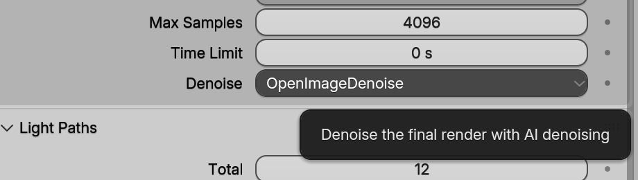
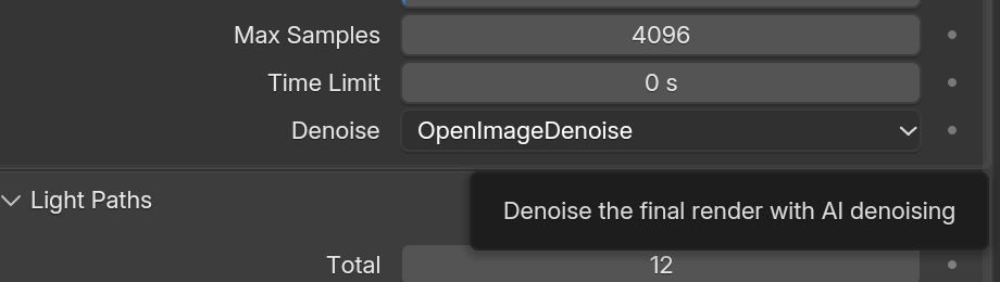
description becomes its tooltip.Layout
Components stack top to bottom by default. These containers arrange them:
| Container | Use it for |
|---|---|
Column(*children, align=False, spacing=None, padding=0) |
A vertical stack. align=True joins the widgets into one block, like Blender’s column(align=True). |
Row(*children, align=False, spacing=None, padding=0) |
Side by side. Each child’s weight is its share of the width. |
Split(left, right, factor=0.4) |
A label / value split: the left side gets factor of the width. Blender’s property rows. |
Grid(*children, columns=2) |
Equal-width columns, filled row by row. |
Box(*children) |
A padded column on Blender’s box background (layout.box()). |
Panel(title, *children, ...) |
A collapsible panel. Put a panel in a panel for a sub-panel. |
Tabs, SideTabs, ScrollView |
Pages with tabs, the properties editor’s icon tabs, and a scrolling viewport. |
VectorField(label, (x, y, z)) |
Aligned X / Y / Z number fields under one label. |
Here’s how they combine into a typical Blender panel:
from blenderui.components import (App, Panel, Row, Split, Label, NumberField,                                  NumberSlider, VectorField, Toggle, Checkbox,                                  Button, IconButton)
def prop(label, widget):    """A Blender property row: right-aligned label, then the value."""    return Split(Label(label, align="right"), widget, factor=0.4)
app = App("Layout", (360, 280),    Panel("Transform",          VectorField("Location", (0.0, 1.25, 0.0), suffix=" m"),          prop("Scale", NumberSlider("", 1.0, min=0, max=4)),          Row(Toggle("X"), Toggle("Y", True), Toggle("Z"), align=True),          icon="OBJECT_DATA"),    Panel("Motion Blur",          prop("Steps", NumberField("", 1, min=1, max=7)),          header=[Checkbox("", True)]),    Row(Button("Apply", icon="CHECKMARK"), IconButton("TRASH", weight=0)))
if __name__ == "__main__":    app.run()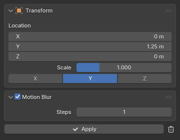
layout_demo.py, rendered by BUI at its real size.A few things to notice:
prop()is a two-line helper, not part of BUI. The components demo uses the same pattern for every property row.Row(..., align=True)joins the toggles into one segmented control.header=[Checkbox("", True)]puts a checkbox in the panel’s header, like Blender’s Motion Blur panel.IconButton("TRASH", weight=0)keeps its natural width while the Apply button takes the rest.VectorFieldpasses extra keywords, likesuffix, to each of its number fields.
Panels behave like Blender’s
Panel(title, *children, collapsed=False, icon=None, header=(), on_toggle=None):
- Click the header to collapse or expand it, with Blender’s animation.
on_toggle(collapsed)tells you. - Drag across several headers to collapse or expand them all in one stroke.
- Ctrl+click a header to solo it: that panel opens and the others close.
- Drag the grip (the dots on the right) to reorder panels.
- In code:
panel.collapsed = True, orpanel.toggle().
Icons
Many components take an icon= name, such as "ADD", "TRASH", "OBJECT_DATA" or "MESH_DATA". The names are Blender’s own icon names. To list every one available:
import buipyprint(buipy.kit_icon_names())Dropdown and EnumRow take a matching list of icons for their items: Dropdown("Mode", ["Object", "Edit"], icons=["OBJECT_DATAMODE", "EDITMODE_HLT"]).
Menus and pie menus
A menu is a list of items. An item is a MenuItem, a plain string, or "-" for a separator.
from blenderui.components import App, IconButton, Label, MenuBar, MenuItem, PieMenu
def new_file(): print("new")def quit_app(): print("quit")def search(): print("search")
menubar = MenuBar(    ("File", [MenuItem("New", new_file, icon="FILE", shortcut="Ctrl N"),              MenuItem("Open Recent", submenu=[MenuItem("a.blend"), MenuItem("b.blend")]),              "-",                                           # separator              MenuItem("Auto Save", checked=True),              MenuItem("Quit", quit_app, shortcut="Ctrl Q")]),    right=[IconButton("SEARCH", search)])
app = App("Tool", (480, 300), Label("Press Q for the pie menu."), header=menubar)app.bind("q", lambda: PieMenu.show(app.ctx, [MenuItem("Object Mode"),                                             MenuItem("Edit Mode")], "Mode"))app.run()
MenuItem(text, on_click=None, *, icon=None, shortcut=None, checked=None, submenu=None, enabled=True, description="").checked=TrueorFalseshows a checkbox;submenu=[...]opens another menu.shortcutis only the text shown on the right; bind the key itself withapp.bind.MenuBar(("File", items), ("Edit", items), right=[...])is Blender’s top bar;rightholds components at the right end.MenuButton(text, items, *, icon=None)is a single pulldown button you can put anywhere.Menu.show(app.ctx, owner, items, title=None, at=None, on_pick=None)opens a popup menu from code, next to theownercomponent or atat=(x, y). Plain-string items callon_pick(text).PieMenu.show(app.ctx, items, title="")opens a pie menu around the pointer, with up to 8 items in Blender’s order: W, E, S, N, NW, NE, SW, SE.
Menus behave as in Blender. Press, drag to an item and release to pick it in one gesture. Hover switches between menu-bar menus and opens submenus. Typing searches every item in the menu. In a pie, flick toward an item and click, or press 1 to 8.
Every value also has a right-click menu for free, with Copy, Paste and Reset.
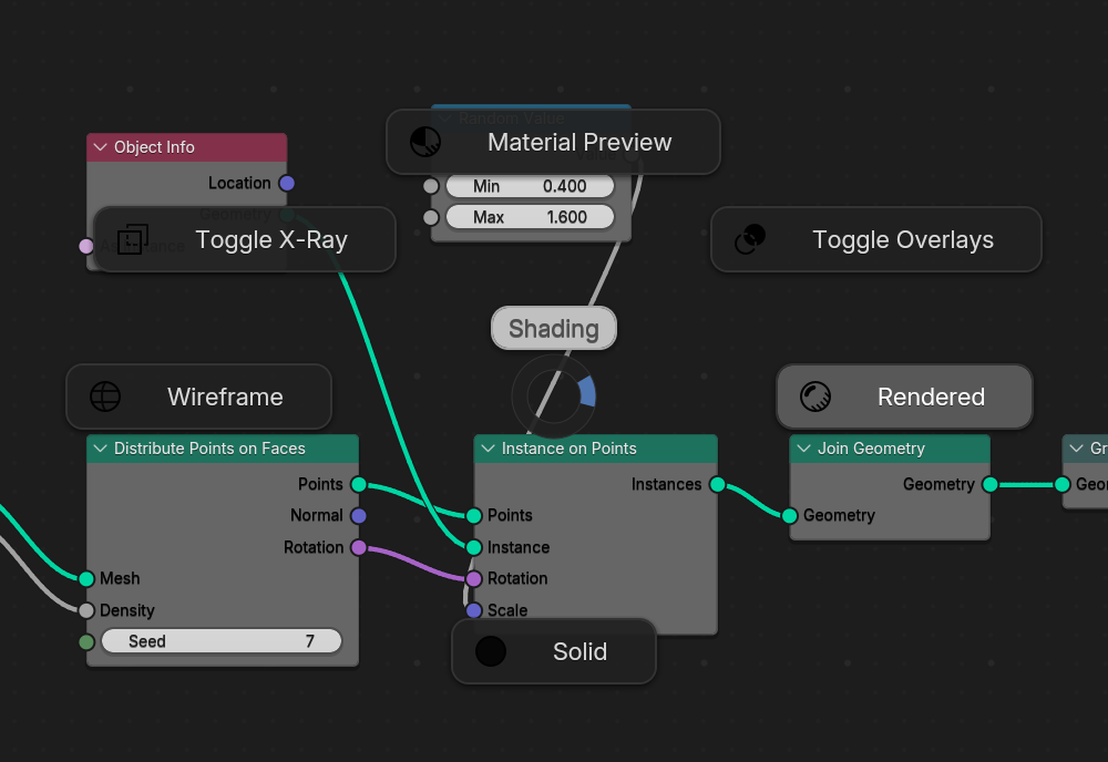
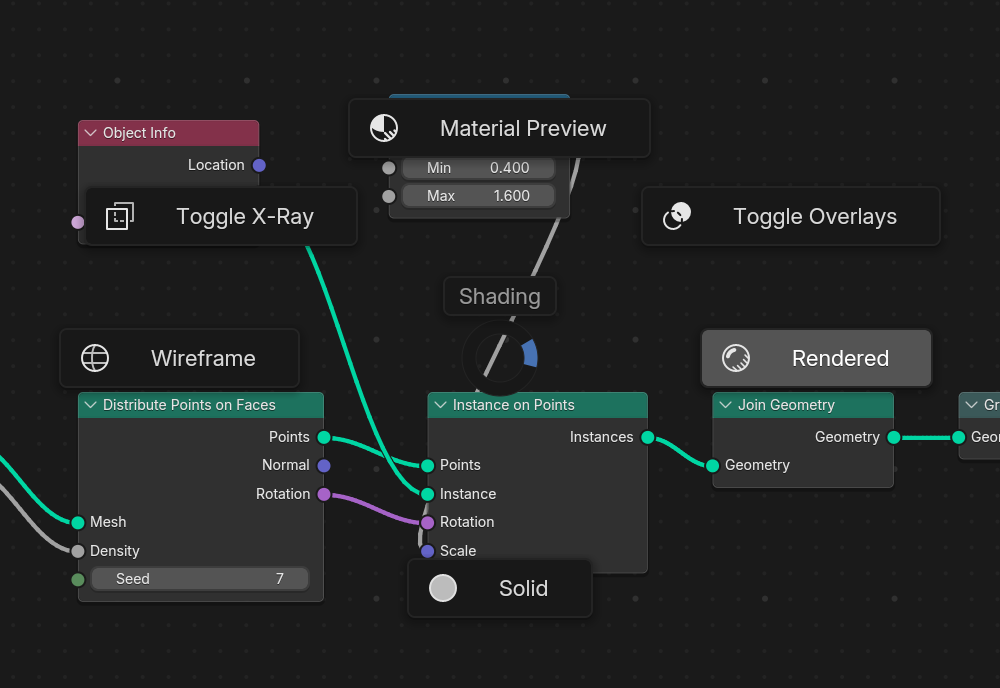
PieMenu: the items sit in a ring and the one toward the pointer is highlighted. Release to pick it (examples/site/geometry_nodes.py).File dialogs
blenderui.filebrowser.ask shows Blender’s File Browser in its own window and waits for the answer:
from blenderui import filebrowser
path = filebrowser.ask("open", title="Open Image",                       filetypes=[("Images", "*.png *.jpg"), ("All files", "*")])folder = filebrowser.ask("directory")paths = filebrowser.ask("open", multiple=True)        # a listname = filebrowser.ask("save", defaultextension=".txt")
The kind is "open", "save" or "directory"; cancelling returns None. tkinter.filedialog and QFileDialog use the same browser.
GPU rendering
Call blenderui.set_gpu(True) before creating windows, or run with BUI_GPU=1, to draw on the GPU: Direct3D 11 on Windows, OpenGL 3.3 on Linux. The pixels are the same; the CPU does much less work.
import blenderuiblenderui.set_gpu(True)The interactions you get
Every value component gets Blender’s interaction rules without any code: drag to scrub with a hidden cursor, Shift for precision, Ctrl to snap, Alt to edit X, Y and Z together, typed math like 2*pi, Ctrl+Wheel to step, drag down over several fields to edit them at once, drag across checkboxes, and undo with Ctrl+Z. The Blender widgets page explains each one.
Next steps
Last updated