
Browser look, styled and Blender components
Make any part of your Rust UI look like a web page or like Blender, and use Blender's real widgets as components.
- Rust
Some apps should look like a web page. Some should look like Blender. Most want a bit of both: a clean document with a few Blender sliders in it. In BUI you choose the look per element, and the choice flows down to everything inside.
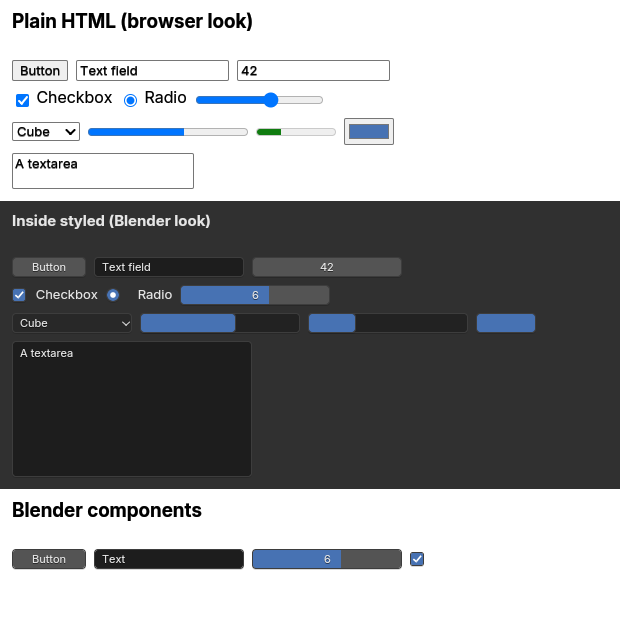
examples/forms.rs (cargo run --example forms).The three looks
- Plain HTML looks like a browser draws it: black text on white, 16 px,
#0000eeunderlined links, and a web browser’s form controls, all in Blender’s UI font, Inter. - Inside
styled, an element and everything in it get Blender’s look: the#303030background,#e6e6e613 px text, blue links, darkcodeandpre, themed tables, fieldsets and dialogs, and Blender’s widgets for the form controls. - Blender components (
Button,NumberSlider,ColorSwatch…) are Blender’s widgets always, insidestyledor not.
Here’s how forms.rs builds the screenshot above. One function makes the controls; the page shows it twice and then adds the components. The example is written with gpui builders; the rsx! tab is the same window in markup.
use blenderui::prelude::*;
fn controls() -> impl IntoElement {    rsx! {        <div flex gap-2 items-center p-3>            <button>"Button"</button>            <input value="Text field" />            <input type="number" value="42" />            <input type="range" min={0.0} max={10.0} value="6" />        </div>    }}
struct Forms;
impl Render for Forms {    fn render(&mut self, _: &mut Window, _: &mut Context<Self>) -> impl IntoElement {        rsx! {            <body m-0 flex flex-col>                <h3>"Plain HTML (browser look)"</h3>                {controls()}                <div styled>                    <h3>"Inside styled (Blender look)"</h3>                    {controls()}                </div>                <h3>"Blender components"</h3>                <div flex gap-2 p-3>                    <Button>"Button"</Button>                    <TextField value="Text" />                    <NumberSlider min={0.0} max={10.0} value="6" />                    <Checkbox checked={true} />                </div>            </body>        }    }}
fn main() { Application::new().run(|cx| { cx.open_window(WindowOptions::default(), |_, cx| cx.new(|_| Forms)).unwrap(); });}use blenderui::prelude::*;
fn controls() -> Div { div().flex().gap_2().items_center().p_3() .child(button().child("Button")) .child(input().value("Text field")) .child(input().input_type("number").value("42")) .child(input().input_type("range").min(0.0).max(10.0).value("6"))}
struct Forms;
impl Render for Forms { fn render(&mut self, _: &mut Window, _: &mut Context<Self>) -> impl IntoElement { body().m_0().flex().flex_col() .child(h3().child("Plain HTML (browser look)")) .child(controls()) .child(div().styled().child(h3().child("Inside styled (Blender look)")).child(controls())) .child(h3().child("Blender components")) .child(div().flex().gap_2().p_3() .child(Button().child("Button")) .child(TextField().value("Text")) .child(NumberSlider().min(0.0).max(10.0).value("6")) .child(Checkbox().checked(true))) }}
fn main() { Application::new().run(|cx| { cx.open_window(WindowOptions::default(), |_, cx| cx.new(|_| Forms)).unwrap(); });}Blender’s look with styled
Mark an element styled and it, and everything inside it, switches to Blender’s built-in stylesheet:
rsx! { <div styled class="p-4">"Blender look"</div> }rsx! { <div styled><div styled="false">"Browser look again"</div></div> } // opt a subtree back outdiv().styled().p_4().child("Blender look")div().styled().child(div().attr("styled", "false").child("Browser look again")) // opt a subtree back out- Your own CSS still wins over either set of defaults.
styledonly swaps the user-agent stylesheet underneath. styled="false"turns it back off for a subtree.- What changes: besides the background, text color and size,
styledgivesprea dark padded block,blockquotea blue left bar,kbda border,markBlender’s orange,theada darker row,fieldsetanddialogBlender’s greys and rounded corners, andhra thin grey line.
Want the whole window in Blender’s look? Put styled on the root element, as the showcase example does with html().styled().
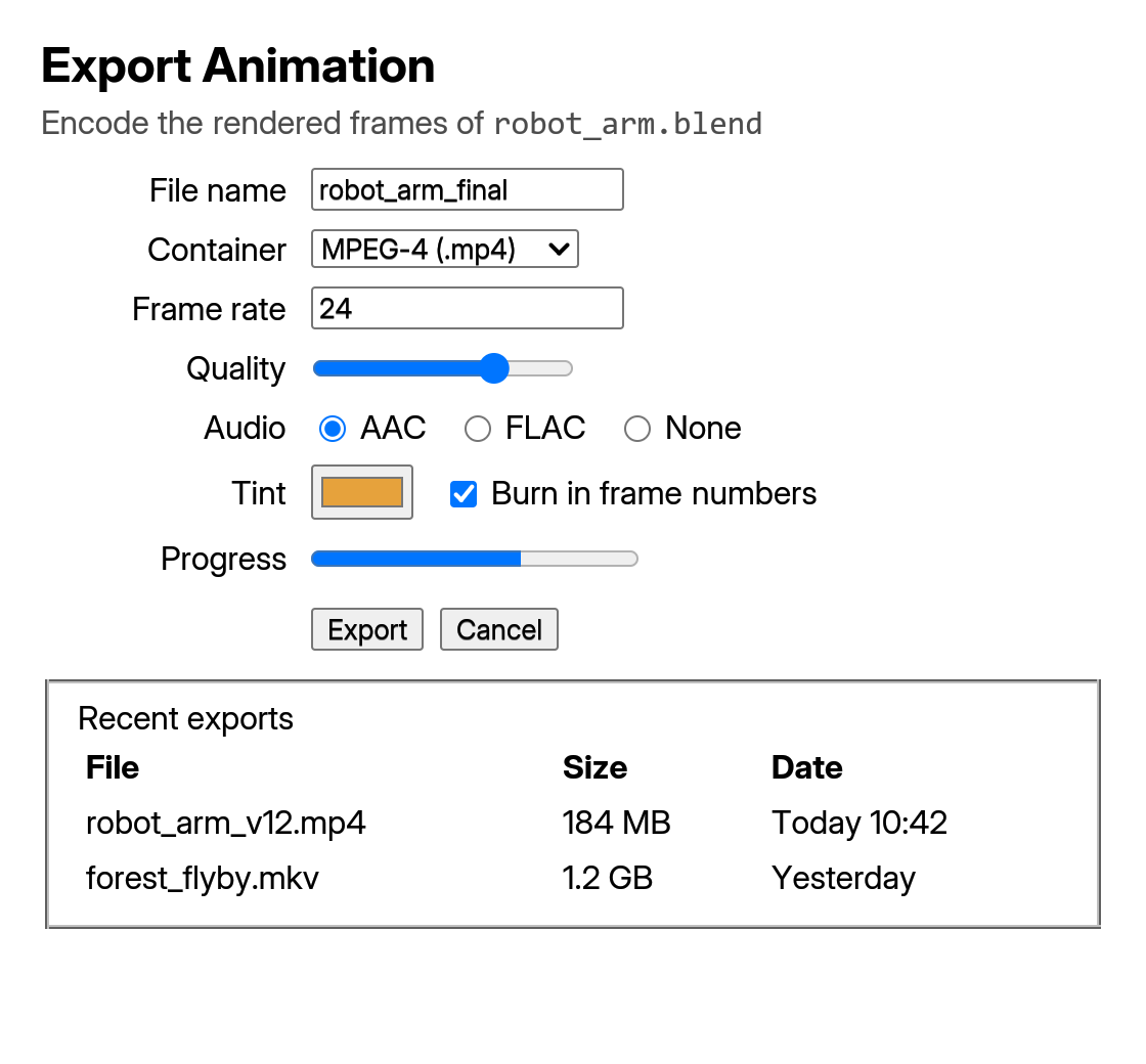
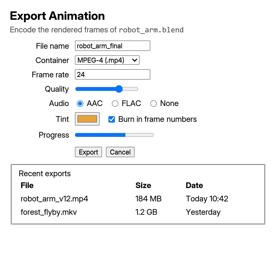
examples/site_plain_html.rs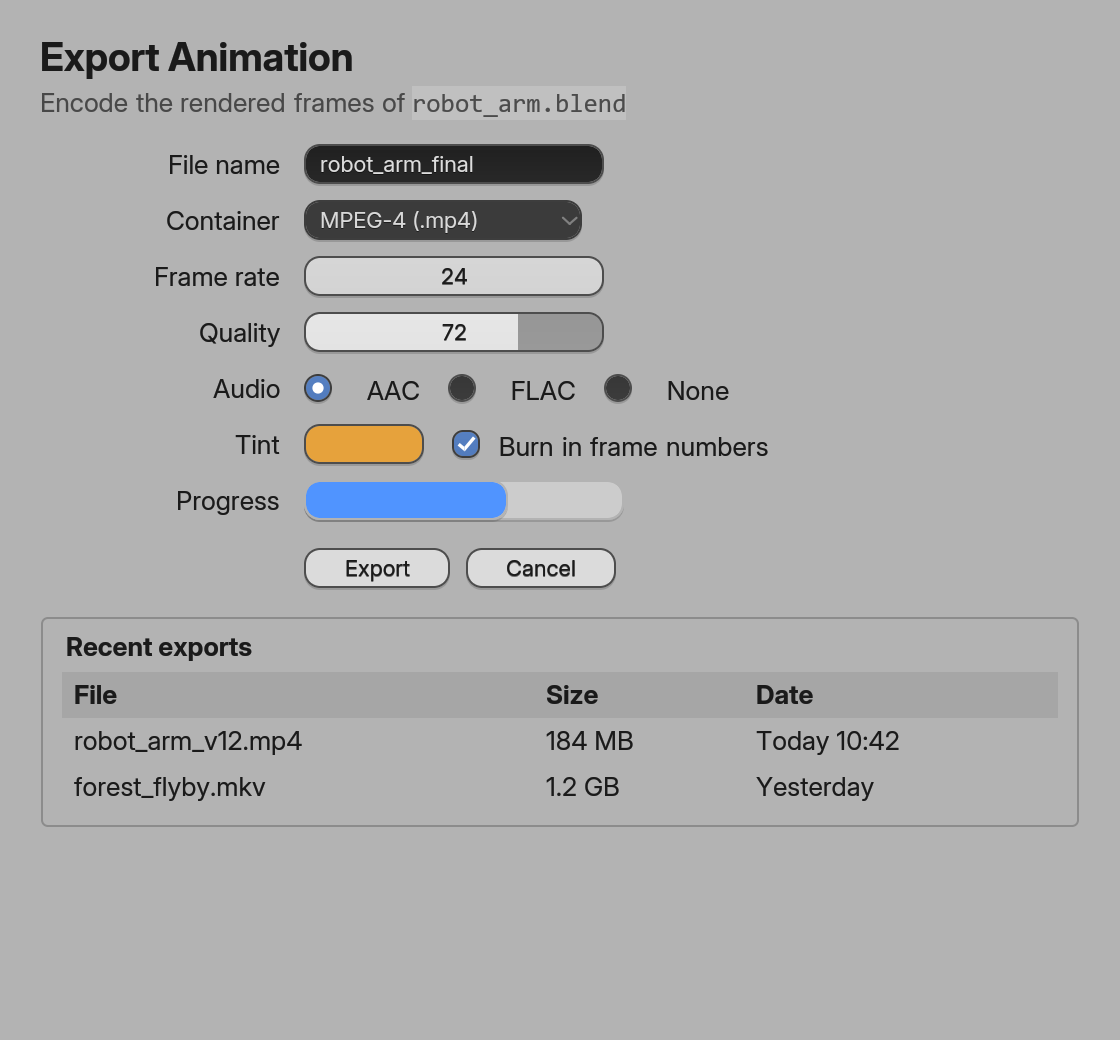
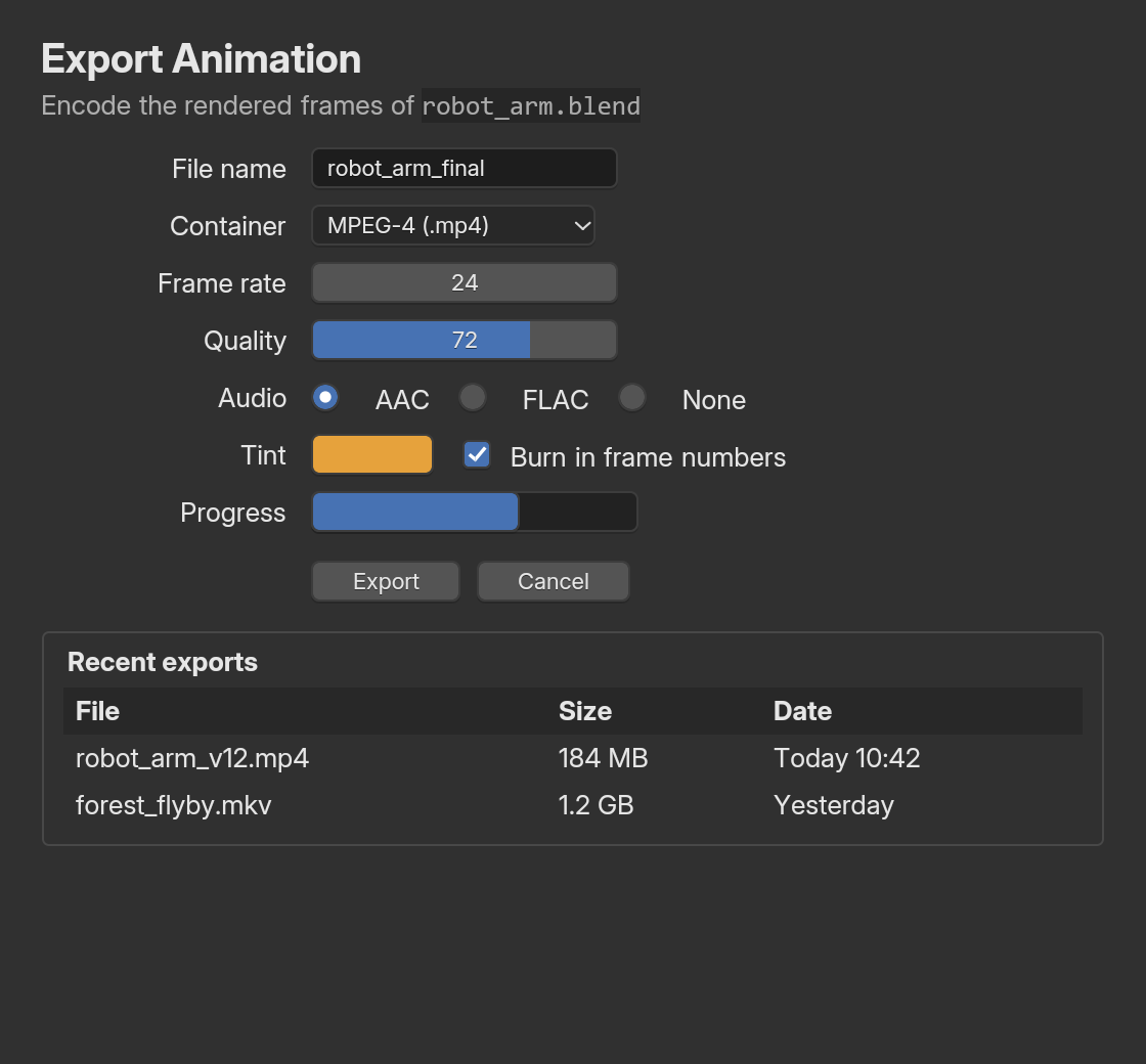
examples/site_styled.rs: the same markupBlender components
These ten components are Blender’s widgets, wherever you put them:
| Component | What you get | Same element as |
|---|---|---|
Button |
Blender’s push button | button() |
Checkbox |
Blender’s checkbox | input type="checkbox" |
Radio |
Blender’s radio button, grouped by name |
input type="radio" |
NumberField |
A number field: drag to change, click to step, double-click to type | input type="number" |
NumberSlider |
A number slider: the field fills with the value | input type="range" |
TextField |
A single-line text field | input type="text" |
TextArea |
A multi-line text editor | textarea() |
ColorSwatch |
A color swatch that opens Blender’s color picker | input type="color" |
Dropdown |
A dropdown menu; options are option() children |
select() |
ProgressBar |
A progress bar (value, max) |
progress() |
Each one is the element it stands for, so every element method and attribute works on it: min, max, step, value, checked, placeholder, disabled, on_change, on_click, styling and so on.
rsx! { <NumberSlider min={0.0} max={10.0} value="2.5" onChange={|e: &ChangeEvent| println!("{:?}", e.number)} /> <Button onClick={|| println!("apply")}>"Apply"</Button> <Dropdown><option>"Cube"</option><option>"Sphere"</option></Dropdown>}div() .child(NumberSlider().min(0.0).max(10.0).value("2.5") .on_change(|e: &ChangeEvent, _, _| println!("{:?}", e.number))) .child(Button().child("Apply").on_click(|_, _, _| println!("apply"))) .child(Dropdown().child(option().child("Cube")).child(option().child("Sphere")))In builder style the components are functions with capitalized names. Listeners take all three parameters, (event, window, cx).
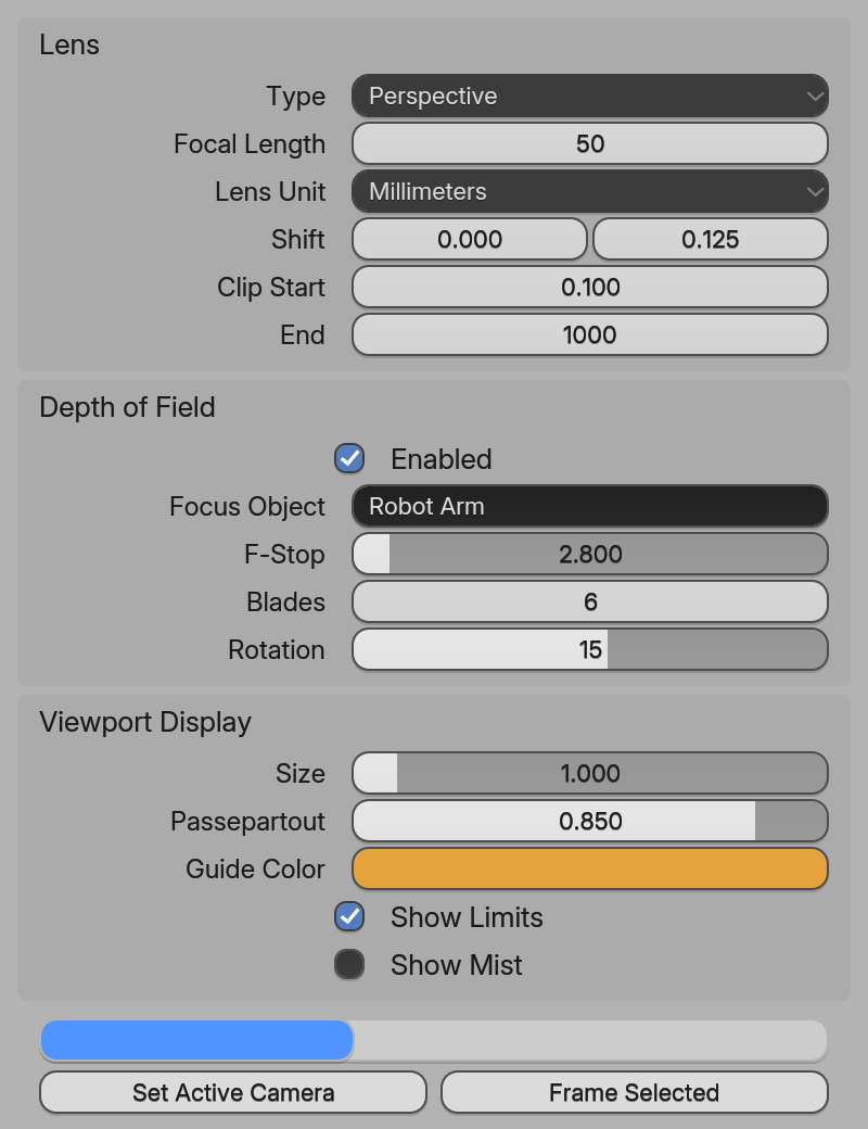
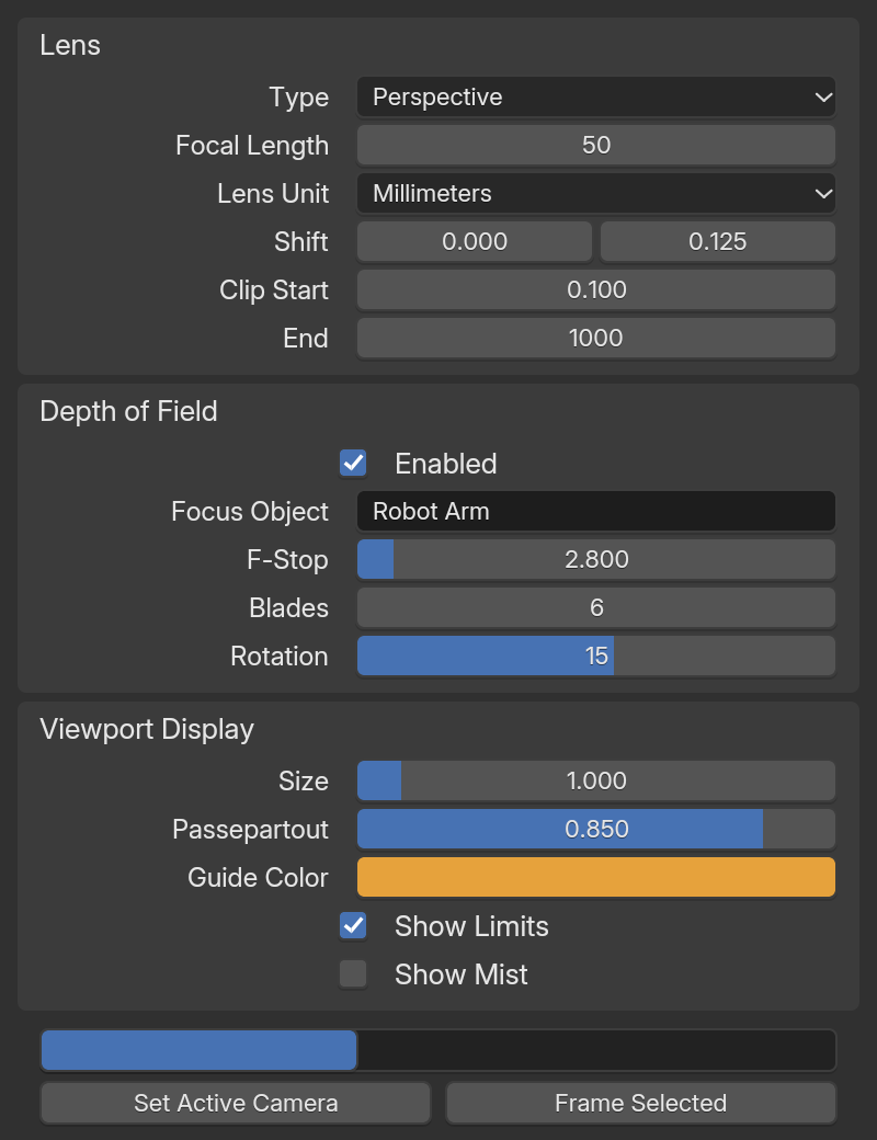
examples/site_components.rs).Form controls
Outside styled, form elements look and behave like a web browser’s: its colors and shapes, typed number fields with spin buttons, a range thumb that jumps to the click. Inside styled, and as Blender components, they’re Blender’s widgets with Blender’s interaction rules: drag a number to change it, double-click to type (number fields also take math such as 2*pi), Ctrl+Z to undo, Esc to cancel.
| HTML | Blender widget | What ChangeEvent carries |
|---|---|---|
button() with text, or input() of type submit, button or reset |
Button | (use on_click) |
input(): text, password (masked), email, search, url, tel, date … |
Text field | value |
input().input_type("number") |
Number field | number, value |
input().input_type("range") |
Slider | number, value |
input().input_type("checkbox") |
Checkbox | checked |
input().input_type("radio"), grouped by name |
Radio button | checked |
input().input_type("color") |
Color swatch (opens Blender’s picker) | value as #rrggbb |
select() with option() / optgroup() |
Dropdown menu | number (the index), value (the text) |
textarea() |
Multi-line text editor | value |
progress(), meter() |
Progress bar | (display only) |
Reading and controlling values
on_input and on_change both fire when the value changes. Each gets a ChangeEvent { value, checked, number }:
rsx! { <input id="vol" type="range" min={0.0} max={100.0} value={format!("{}", self.volume)} onInput={cx.listener(|this, e: &ChangeEvent, _, cx| { this.volume = e.number; cx.notify(); })} />}input().id("vol").input_type("range").min(0.0).max(100.0) .value(format!("{}", self.volume)) .on_input(cx.listener(|this, e: &ChangeEvent, _, cx| { this.volume = e.number; cx.notify(); }))- Values you pass are pushed to the widget only when they change between renders. A field the user is typing in isn’t reset under their fingers.
- To control a field, keep its value in your state and update it from
on_change, as above. Give it an.id(...)so it keeps its identity across renders. - A
button()holding elements other than text is laid out as an ordinary box (style it with CSS) and still getson_click.
Next steps
Last updated